| Author | Thread |
|
|
06/18/2006 01:55:36 AM |
| Great simplicity! Congratulations on your top 11th place finish. |
|
 Photographer found comment helpful. Photographer found comment helpful. |
|
|
06/12/2006 05:58:25 PM |
Congratulations on your top 20 finish. Great shot!
Message edited by author 2006-06-12 18:00:48. |
|
| Photographer found comment helpful. |
|
|
06/12/2006 03:50:18 PM |
| I'm glad others saw this as such a great piece of work. Congrats on your high placement. |
|
| Photographer found comment helpful. |
|
|
06/12/2006 02:42:39 PM |
| Congrats on your top 20 finish. You're on a 6+ roll lately! Keep up the strong work. |
|
| Photographer found comment helpful. |
Comments Made During the Challenge  |
|
|
06/11/2006 10:24:21 PM |
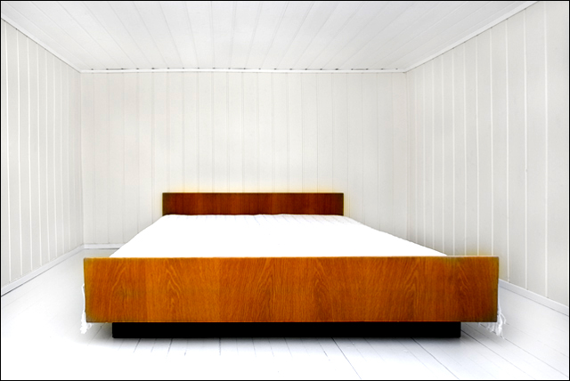
| It's a big bed! I wish the blanket on the bed would have some details and not be so overexposed. Nice composition, I like it. |
|
| Photographer found comment helpful. |
|
|
06/11/2006 10:04:51 PM |
| New to voting, no special comment here ... |
|
| Photographer found comment helpful. |
|
|
06/11/2006 07:53:31 PM |
There is nothing really in focus and you have some fringing around the headboard. What is the subject? My eye is confused.
TC |
|
| Photographer found comment helpful. |
|
|
06/11/2006 04:44:19 PM |
| what a huge bed....i am jealous! |
|
| Photographer found comment helpful. |
|
|
06/10/2006 02:41:44 PM |
| There's a bit of coloration near the he3adboard and the corner of the footboard, as though the walls were desaturated but the selection wasn't quite complete in those areas. Nice idea, nice lines. |
|
| Photographer found comment helpful. |
|
|
06/09/2006 07:57:59 AM |
| Wow...now that is white...but awfully small. |
|
| Photographer found comment helpful. |
|
|
06/09/2006 07:39:54 AM |
| I love the composition; its a touch grainy for me, and th ecolor of the wood is saturated or something- but that is personal mtaste; the feel is terrific. |
|
| Photographer found comment helpful. |
|
|
06/09/2006 12:23:25 AM |
Gives me that same eerie feeling that was presented in THX1138.
Well done! |
|
| Photographer found comment helpful. |
|
|
06/08/2006 11:46:28 AM |
| I like the geometrical aspect of this photo. The wood contrasts the white very well. It does seem a bit uneven to me perspective wise. |
|
| Photographer found comment helpful. |
|
|
06/07/2006 06:33:23 PM |
| This has the look of a film set about it. Nice tone, simplicity and composition. Could use a little more USM maybe? |
|
| Photographer found comment helpful. |
|
|
06/07/2006 10:26:56 AM |
| Is this for an Ikea commercial..;-) |
|
| Photographer found comment helpful. |
|
|
06/06/2006 08:47:27 PM |
| I like the emptiness of the walls. Nice presentation, too. |
|
| Photographer found comment helpful. |
|
|
06/06/2006 06:07:59 PM |
This is the most comfortable bedroom I've ever seen. Just kidding ;).
I like this one a lot. It's different from the photos I've seen so far. I like it that you used lots of white, it's refreshing. |
|
| Photographer found comment helpful. |
|
|
06/06/2006 12:45:54 PM |
| was this photo desaturated around the bed. reason for color bleed? |
|
| Photographer found comment helpful. |
|
|
06/06/2006 06:55:20 AM |
nice idea, but what's the difference between 'take one thing into an empty room' and 'find a basically empty room with one thing in it'? sorry to be anal, but really...
also, the processing on this seems way off. |
|
| Photographer found comment helpful. |
|
|
06/06/2006 06:08:51 AM |
| great, really great ... i would like to see it in B&W with grain :-) |
|
| Photographer found comment helpful. |
|
|
06/05/2006 11:03:16 PM |
|
| Photographer found comment helpful. |
|
|
06/05/2006 09:20:58 PM |
| Hal is my bed made? only sugertion would be to tuck in the frills on the cover they take away from the look and feel |
|
| Photographer found comment helpful. |
|
|
06/05/2006 07:51:09 PM |
| Ilike the shapes in this image, they all fit together 7 |
|
| Photographer found comment helpful. |
|
|
06/05/2006 07:06:44 PM |
| How did you... :/ This is a very cool shot :) |
|
| Photographer found comment helpful. |
|
|
06/05/2006 05:28:44 PM |
| Spectacular white room! Great composition. I love it. |
|
| Photographer found comment helpful. |
|
|
06/05/2006 03:35:33 PM |
| Normally I would recommend against a symetrical composition but this subject cries out for it. Better in my opinion with a straight-on shot of the bed exactly centered in the room and the frame. Even as is, among my favorities this challenge. |
|
| Photographer found comment helpful. |
|
|
06/05/2006 02:32:18 PM |
| I may have scored this higher with a shot from the center of the foot of the bed. I like the contrast of the darker wood with the bright white of the rest of the room. |
|
| Photographer found comment helpful. |
|
|
06/05/2006 01:35:59 PM |
| Nice image, the wood grain works great... maybe a slight angle instead of a straight on perspective to add a bit more interest. |
|
| Photographer found comment helpful. |
|
|
06/05/2006 01:03:14 PM |
| That is my kind of bedroom! The colors here are done well. |
|
| Photographer found comment helpful. |
|
|
06/05/2006 12:52:58 PM |
| This is very retro and clean feeling. I like the darkwood as it adds interest. Nice photo ! |
|
| Photographer found comment helpful. |
|
|
06/05/2006 10:52:27 AM |
| It almost looks like a padded room! |
|
| Photographer found comment helpful. |
|
|
06/05/2006 09:55:44 AM |
| nice depth, I like the brightness too. |
|
| Photographer found comment helpful. |
|
|
06/05/2006 09:50:56 AM |
| I think that the idea is good but you need a better simmetry |
|
| Photographer found comment helpful. |
|
|
06/05/2006 08:28:09 AM |
| Looks like the cover of a modern interior design magazine. Very stark and minimalistic. Nicely done. |
|
| Photographer found comment helpful. |
|
|
06/05/2006 08:12:27 AM |
| nice pic looks like a showroom love how the wood adds some color. |
|
| Photographer found comment helpful. |
|
|
06/05/2006 05:47:38 AM |
| You tookthat into the room!!?? It doesn't even look like it would fit through a doorway! |
|
| Photographer found comment helpful. |
|
|
06/05/2006 05:16:51 AM |
|
| Photographer found comment helpful. |
|
|
06/05/2006 01:46:47 AM |
| really cool ... pity the bed appears not to be centred. |
|
| Photographer found comment helpful. |
|
|
06/05/2006 12:41:06 AM |
| Nice. Reminds me of the ending setting in 2001: A Space Odyssey. The headboard (and some of the front of the bed) have this distracting yellowish halo, though. |
|
| Photographer found comment helpful. |
|
|
06/05/2006 12:20:46 AM |
| talk about minimalist! well done! |
|
| Photographer found comment helpful. |
Home -
Challenges -
Community -
League -
Photos -
Cameras -
Lenses -
Learn -
Help -
Terms of Use -
Privacy -
Top ^
DPChallenge, and website content and design, Copyright © 2001-2025 Challenging Technologies, LLC.
All digital photo copyrights belong to the photographers and may not be used without permission.
Current Server Time: 03/12/2025 04:40:21 PM EDT.