| Author | Thread |
|
|
08/25/2003 11:11:04 AM |
| Tim I LOVE this shot! I really like how you kept the tree layer on the bottom just to anchor the shot. Beautifully done. |
|
|
|
08/25/2003 07:43:03 AM |
| this was an incredible shot. i bet if u got it at a diff time of day it would be even better. i gave this an 8. |
|
Comments Made During the Challenge  |
|
|
08/24/2003 11:44:32 PM |
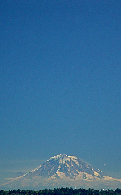
| Little bit fuzzy, but I know it's hard with this kind of image to achieve sharpness. Also, I know this is negative space challenge, but sometimes less is actually more. |
|
|
|
08/24/2003 11:25:36 PM |
| Beautiful shot! The mountain seems to be floating, and all the sky at the top makes the shot unique and beautiful. |
|
|
|
08/24/2003 01:23:57 PM |
| One of the more symmetrical views ... I should be able to figure out where its shot from eventually ... |
|
|
|
08/23/2003 11:30:05 PM |
| The bottom part is really cool. I think you have too much space on top and also the sky seems to be banding or pixelating, or both. Oversaturated? Maybe... Good luck. Good shot. |
|
|
|
08/23/2003 12:59:55 AM |
| the vast sky makes this massive mountain seem like a bump in the horizon - great juxtaposition. I think there is a bit too much sky however, its just a shade off balance..maybe if you shaved off the top cm of sky? :) (not that that is a great complaint, its still a fine shot!) |
|
|
|
08/22/2003 05:43:41 PM |
| Thats beautiful, is that a ufo on the right there? 8 |
|
|
|
08/21/2003 12:02:42 AM |
|
|
|
08/20/2003 02:49:03 PM |
| I like this composition 8 |
|
|
|
08/19/2003 04:16:04 PM |
| Ilike what you ahve done with this image, espcially croping the foreground trees. I agree that this fits the challenge, but Mt. Rainier is a magnificent mountain and should be more prominent in any image of it. |
|
|
|
08/19/2003 01:06:36 PM |
| Pretty shot. I really didn't need all that sky to get the point across. Less is more. The mere fact that this picture has a beautiful 3D quality would have been enough. Cropping two thirds of the way down would have been just as efffective. |
|
|
|
08/19/2003 10:31:34 AM |
| Not being able to vote, I almost didn't take the time to leave a comment on this, but I have to tell you, this is one of my favorites of the challenge. The only things I don't care for is the little white thing in the lower left by the treeline (looks like a water tower or something) and the white spec to the right of the mountain (looks like a plane maybe). I'm sure you had no choice but to have them in the shot, but the peak itself is so beautiful and natural, it's a shame to have seemingly man-made items touch the scene. Despite that, if I could vote, I would give you a 10. I absolutely love this. |
|
|
|
08/19/2003 08:16:46 AM |
| Very nice picture! Good use of negative space! - 8 |
|
|
|
08/18/2003 10:17:16 PM |
| Negative space should have a purpose. This is negative space for the sake of the challenge. |
|
|
|
08/18/2003 09:50:23 PM |
| For me, just too much sky part for the balance to work. Lovely colours, though. 6 |
|
|
|
08/18/2003 04:45:47 PM |
|
|
|
08/18/2003 03:10:30 PM |
|
|
|
08/18/2003 02:42:02 PM |
very nice landscape shot I love that forest....
it is a bit grainy and there are some blown out spots... guess you could not do a thing about it, so it wont count in my vote...
This is great, try usin Neatimage of you have such a grainy image again :)
good luck in the challenge, v. |
|
|
|
08/18/2003 11:26:35 AM |
Such a beautiful photo and wonderful use of negative space. This makes me miss being in Boulder, Co. so much. Good luck !
|
|
|
|
08/18/2003 11:00:25 AM |
| I think NeatImage would do good for this nice shot |
|
|
|
08/18/2003 10:13:38 AM |
-
Message edited by author 2005-04-09 00:15:58. |
|
|
|
08/18/2003 07:14:32 AM |
| Interesting image, nice effort. 7 Morgan |
|
|
|
08/18/2003 05:56:55 AM |
| I like this style, but it is overdone. This is one of the more interesting ones, though. |
|
|
|
08/18/2003 04:26:15 AM |
| very nice. great blue colour. Even a mountain can look small, with good use of negative space |
|
|
|
08/18/2003 01:11:37 AM |
| Nothing but the open sky could make Mt. Rainier look so small. A very moving composition and a beautiful subject. |
|
|
|
08/18/2003 12:40:42 AM |
| Nice seting but too much haze in the air 9 from me! |
|
|
|
08/18/2003 12:31:42 AM |
| Nice shot. I like the composition. Meets the challenge. Only thing is there are some white spots on the right and near the bottom that I find distracting but I\'m nit picking. I really find this shot effective. Good luck. |
|
|
|
08/18/2003 12:30:24 AM |
| image is a bit noisy - rainier is a beautiful place, but i am not sure if the blank sky works for it well. |
|
Home -
Challenges -
Community -
League -
Photos -
Cameras -
Lenses -
Learn -
Help -
Terms of Use -
Privacy -
Top ^
DPChallenge, and website content and design, Copyright © 2001-2025 Challenging Technologies, LLC.
All digital photo copyrights belong to the photographers and may not be used without permission.
Current Server Time: 03/12/2025 04:13:19 AM EDT.