| Author | Thread |
Comments Made During the Challenge  |
|
|
07/21/2002 03:54:00 PM |
|
|
|
07/21/2002 12:22:00 PM |
| Excellent shot. 8-ClubJuggle |
|
|
|
07/20/2002 09:45:00 PM |
|
|
|
07/20/2002 02:05:00 PM |
I feel as though something is missing or is not quite right - just my opinion. I'm not getting that 'wow' or 'awwe' feeling - sorry. Still it is interesting.
Ruthann |
|
|
|
07/19/2002 02:25:00 PM |
|
|
|
07/18/2002 10:46:00 PM |
|
|
|
07/18/2002 04:30:00 PM |
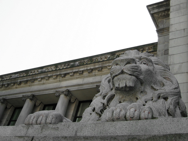
| Cloudy day? Really neat angle shot. I like everything except the empty sky. I'm sure it couldn't be helped, but it "looks" missing. 8 Swash |
|
|
|
07/18/2002 01:46:00 PM |
| Nice focus and capture of the details. I also like the perspective and framing of this shot. I think it needs just a little more contrast/brightness. That way the shadows would be darker, and the light parts would be contrasted more, giving the image a little more "oomph." karmat |
|
|
|
07/18/2002 08:44:00 AM |
| Ah, the curse on the overcast sky. |
|
|
|
07/17/2002 06:31:00 PM |
|
|
|
07/17/2002 05:55:00 PM |
| fine. a bit more contrast. |
|
|
|
07/17/2002 12:44:00 PM |
| I like the angle you took it from for face, but the way the roof line comes right down to the cat's head is distracting. Just a slightly different angle, maybe? |
|
|
|
07/17/2002 11:57:00 AM |
| This is a neat image, but I think the overall composition needs a little more contrast for higher impact. If the sky had been a nice dark blue here, I think the overall presentation would have been very nice! I know you can't control the weather though :) = 7 - jmsetzler |
|
|
|
07/17/2002 10:03:00 AM |
| nice angle. i would've liked more of the lion, but this is good. |
|
|
|
07/17/2002 07:36:00 AM |
| good use of thirds...like the angle!! |
|
|
|
07/16/2002 06:12:00 PM |
|
|
|
07/16/2002 05:32:00 PM |
|
|
|
07/16/2002 11:43:00 AM |
| All that sky on top is pretty distracting.A tighter crop on top and maybe tweak the contrast and light/dark settings. |
|
|
|
07/16/2002 02:39:00 AM |
| a nice greek look. i would like to see more of the lion's face, and it wouldn't really wreck the composition if you used a slightly higher angle. you did a nice job of bringing out the contour in the stone carving. |
|
|
|
07/16/2002 01:44:00 AM |
| Nice detail in the lion pity about the bleached out sky |
|
|
|
07/15/2002 05:14:00 PM |
| WoW! Great composition. I really like the simplicty in this image. |
|
|
|
07/15/2002 11:44:00 AM |
| Very nice shot. I would only of wished the sky was blue and the bottom cropped a bit more. All in all this is a good shot. Kee |
|
|
|
07/15/2002 10:51:00 AM |
| a little to much white sky, but very nice |
|
|
|
07/15/2002 10:39:00 AM |
| not much to say on this one. sorry 7 |
|
|
|
07/15/2002 05:54:00 AM |
|
|
|
07/15/2002 01:18:00 AM |
| I like the angle, very interesting shot, 7 |
|
|
|
07/15/2002 12:59:00 AM |
| A blue sky would have given a lot more depth to the photo. With the white sky, it looks a bit flat. |
|
Home -
Challenges -
Community -
League -
Photos -
Cameras -
Lenses -
Learn -
Help -
Terms of Use -
Privacy -
Top ^
DPChallenge, and website content and design, Copyright © 2001-2025 Challenging Technologies, LLC.
All digital photo copyrights belong to the photographers and may not be used without permission.
Current Server Time: 03/12/2025 06:43:06 PM EDT.