| Author | Thread |
|
|
06/09/2006 11:05:50 PM |
::: Greetings from Critique Club :::
Hi, as requested, here is an indepth critique of your submission.
First Impression - the most important one:
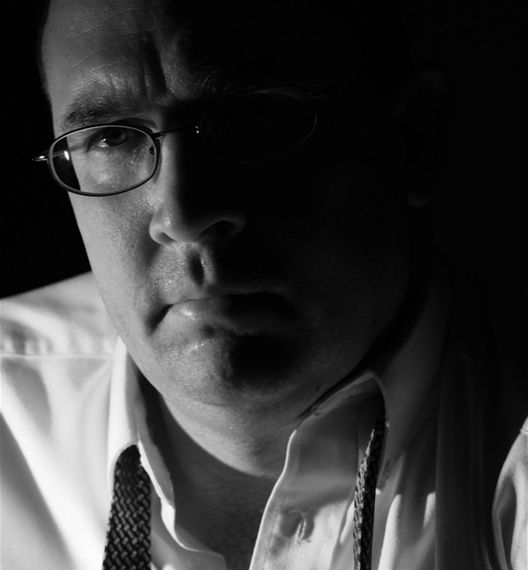
Nice shot, but I'm seeing a few imperfections that could have easily been fixed.
Composition:
I like the composition for a portrait. It may be a little tight, but not by much.
Subject:
Can't really miss him and there isn't any distracting background ,so all is good on that front. Also, looks like you met the challenge well.
Technical (Color, focus, and light):
Color: I like the black and white treatment, very natural feeling. I think I'd like to see a bit more midtone contrast, but overall the treatment is good.
Focus: Sharp and nice detail. Losing a bit of sharpness on the end of the nose, so perhaps a bit deeper DoF is needed.
Light: I like the lighting. I wish the light fall off on the face would have followed down the neck though.
Other: There is a big distracting white spot over the glasses in the dark part of the face. Since this was an advance editting challenge, I think you should have cloned that out. I think it would make a big difference in the shot.
To grow its vote?:
Well, the overall quality of photos in this challenge was very good, so I'd guess that you just got beat by other more interesting subject matter, rather than by your technique. A few technical flaws fixed would have helped a bit.
Summary:
A rather nice portrait with nice lighting. Good work.
Hope to see more from you soon,
Leroy |
|
 Photographer found comment helpful. Photographer found comment helpful. |
Comments Made During the Challenge  |
|
|
06/06/2006 09:40:58 PM |
This is like an add for a headache pain reliever... :o)
I like it! |
|
| Photographer found comment helpful. |
|
|
06/03/2006 10:49:25 PM |
| Nice image, well exposed, focused and composed. My nit is I would have liked a little more light on the right side of the face. 6 |
|
| Photographer found comment helpful. |
|
|
06/02/2006 02:57:52 PM |
|
| Photographer found comment helpful. |
|
|
06/02/2006 08:56:11 AM |
|
| Photographer found comment helpful. |
|
|
06/01/2006 06:07:42 PM |
| need to line up the glasses with the face, good lighting otherwise |
|
| Photographer found comment helpful. |
|
|
06/01/2006 08:28:54 AM |
| Looks tired...Take the day off tomorrow. |
|
| Photographer found comment helpful. |
|
|
06/01/2006 02:39:14 AM |
| Nice job with the lighting - having half the face in shadows sets a mood here. The expreswsion fits well with the story you are trying to tell - he looks like it's been a long day/night and he'd love to just go home. |
|
| Photographer found comment helpful. |
|
|
05/31/2006 09:40:50 AM |
| the way the glasses on the left side of the photo make it look like his face is squished in is really distracting. otherwise nice photo, lighting, and mood. |
|
| Photographer found comment helpful. |
Home -
Challenges -
Community -
League -
Photos -
Cameras -
Lenses -
Learn -
Help -
Terms of Use -
Privacy -
Top ^
DPChallenge, and website content and design, Copyright © 2001-2025 Challenging Technologies, LLC.
All digital photo copyrights belong to the photographers and may not be used without permission.
Current Server Time: 03/14/2025 04:06:30 AM EDT.