| Author | Thread |
|
|
06/23/2006 08:45:17 PM |
Coming from my 1-4-0 thread ...
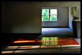
I can see why this is your (current) favourite shot Cyler, the bg is great but I must dissagree with the crisp focus comment below, yes, the wall is fantastic but for me Trevors hair is a little soft.
Both the challenge name and the title (for me) would be better depicted if Trevor was facing a corner as was mentioned during the challenge comments and maybe a wider angle.
|
|
 Photographer found comment helpful. Photographer found comment helpful. |
|
|
06/12/2006 01:09:23 AM |
Hey there from the Critique Club
Camera Work/Technical: Very, very nice. Your focus is crisp and your coloring is perfect for this image.
Lighting: Yet another strength for this image. You did a terrific job with contrasting highlights and shadows to present a very moody photograph.
Composition/Content: I think that the centered composition works very well for this image. The cap provides a great leading line that sends the eye up and down the entire frame.
My Opinion: I think that you were robbed. This is a much better photograph than 5.19. I think including more of the empty basement would have helped the score, but I do get a strong feeling of emptiness with the composition as it is.
Eric
|
|
| Photographer found comment helpful. |
Comments Made During the Challenge  |
|
|
06/11/2006 11:03:26 PM |
|
| Photographer found comment helpful. |
|
|
06/09/2006 07:31:34 AM |
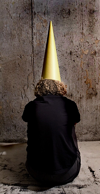
| Ohhhh...so that's wear my cap went too...damn! |
|
| Photographer found comment helpful. |
|
|
06/07/2006 04:24:19 AM |
Dunces are supposed to be in a corner aren't they? :-)
Good use of colour - lighting perhaps a shade strong |
|
| Photographer found comment helpful. |
|
|
06/06/2006 10:54:30 PM |
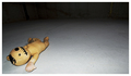
| Hey, how'd you get that old pic of me ;-) Nice shot. |
|
| Photographer found comment helpful. |
|
|
06/06/2006 09:13:08 PM |
| Good idea, but I do not feel the emptiness of the room because such a small part of it is shown. |
|
| Photographer found comment helpful. |
|
|
06/06/2006 07:53:31 PM |
| I'm not seeing an empty room here. |
|
| Photographer found comment helpful. |
|
|
06/06/2006 05:50:06 AM |
|
| Photographer found comment helpful. |
|
|
06/05/2006 11:23:35 PM |
I don't get a sense of an emtpy room.
Nice comp, interesting idea, great texture, light nice, nice pix but.... |
|
| Photographer found comment helpful. |
|
|
06/05/2006 08:54:06 PM |
| good idea maybe a little more space around the figure 5 |
|
| Photographer found comment helpful. |
|
|
06/05/2006 05:15:10 PM |
|
| Photographer found comment helpful. |
|
|
06/05/2006 05:12:00 PM |
| I thought you sent him to the corner, not much of a room here |
|
| Photographer found comment helpful. |
|
|
06/05/2006 01:44:49 PM |
| Good colors, good story line... |
|
| Photographer found comment helpful. |
|
|
06/05/2006 08:37:01 AM |
| I'd like to see more of the room, diminishing the significance of the "dunce" in the corner. Great cracks and lines in the walls and floor - I think it would give more of the "empty room" sense if you backed up 10-15 feet. |
|
| Photographer found comment helpful. |
|
|
06/05/2006 07:17:44 AM |
| Nice idea. The crop kinda bothers me though. I would like to see some more of the room. Maybe a corner or something? 7 |
|
| Photographer found comment helpful. |
|
|
06/05/2006 02:53:24 AM |
|
| Photographer found comment helpful. |
|
|
06/05/2006 12:58:52 AM |
| hehehee... I was thinking of entering a pic like this for the failure challenge, nice job though, love the textured room and composition |
|
| Photographer found comment helpful. |
Home -
Challenges -
Community -
League -
Photos -
Cameras -
Lenses -
Learn -
Help -
Terms of Use -
Privacy -
Top ^
DPChallenge, and website content and design, Copyright © 2001-2025 Challenging Technologies, LLC.
All digital photo copyrights belong to the photographers and may not be used without permission.
Current Server Time: 12/14/2025 02:08:17 PM EST.