| Author | Thread |
|
|
06/13/2006 04:13:53 AM |
Hi from the Critique Club!
In line with the challenge, I have looked at the original image too, which I loved by the way;)You have produced two wonderful images that would grace any wall;)
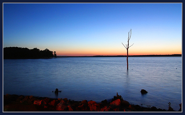
This retake has a totally different feel due the different lighting conditions; your first one having lovely soft orange hues and tones, and this one those gorgeous blues. The line of orange/yellow/red on the horizon contrasts beautifully against the blue, and is picked up in the rocks in the foreground.
The composition is a bold choice as you place your horizon in the middle, cutting the image in two. I am wondering if you did this to avoid replicating the first image too closely? I would have loved to have seen the horizon placed higher as in the first one. The horizon also looks a tad off to me, which seems to emphasize the cutting in half element. Don't get me wrong, it's lovely as it is, but I think the colours were different enough for you to get away with copying your other image's placement of the horizon,and perhaps have upped your already excellent score;)
The tree is wonderful and dramatic, I just wish it were a little closer to the foreground and filled the frame more, I guess I'm just greedy;)
You're obviously an expert at finding the right aperture and shutter speed for these lovely evening shots, and the image is clean and crisp.
A beautiful take two, can't wait to see 3 and 4;)
Message edited by author 2006-06-14 00:41:50. |
|
 Photographer found comment helpful. Photographer found comment helpful. |
Comments Made During the Challenge  |
|
|
06/12/2006 01:07:44 PM |
| Gorgeous shot> i didnt look up the original but it doesnt matter. Great colors and the lonely tree works great. Bumping up. |
|
| Photographer found comment helpful. |
|
|
06/11/2006 04:26:03 PM |
| Great color and positioning of the lone tree/branch. I would have cropped out the bottom part of the shot, but that's just my preference. |
|
| Photographer found comment helpful. |
|
|
06/10/2006 12:23:58 AM |
| Very serene. Nice colours. |
|
| Photographer found comment helpful. |
|
|
06/08/2006 07:49:30 PM |
Don't know the original so I don't know wheither you did better or worse.
Colours are good but it is a bit irritating that the tree bends at the horizon. Using rule of thirds I would have preferred to have the horizon a bit lower or higher, not in the middle of the picture. That is just me! |
|
| Photographer found comment helpful. |
|
|
06/07/2006 08:41:22 PM |
|
| Photographer found comment helpful. |
|
|
06/06/2006 02:36:42 PM |
| Nice color. Good placement I would like to see the first time. |
|
| Photographer found comment helpful. |
|
|
06/06/2006 01:13:51 PM |
| I find the foreground slightly bothersome. |
|
| Photographer found comment helpful. |
Home -
Challenges -
Community -
League -
Photos -
Cameras -
Lenses -
Learn -
Help -
Terms of Use -
Privacy -
Top ^
DPChallenge, and website content and design, Copyright © 2001-2025 Challenging Technologies, LLC.
All digital photo copyrights belong to the photographers and may not be used without permission.
Current Server Time: 04/16/2025 10:28:37 PM EDT.