| Author | Thread |
|
|
09/07/2003 11:38:06 AM |
*Critique Club*
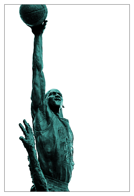
Very nice image, excellent focus and detail. Lighting worked well here. Only thing I don't like is the white background it is just to white and there is nothing there. |
|
 Photographer found comment helpful. Photographer found comment helpful. |
|
|
09/01/2003 05:55:24 PM |
| mark me down for the third person that thinks you were screwed. |
|
| Photographer found comment helpful. |
|
|
09/01/2003 08:38:42 AM |
| dude. i gave this a 9 and fully expected it to ribbon! it's awesome and you should be proud. |
|
| Photographer found comment helpful. |
|
|
09/01/2003 01:31:52 AM |
| I'm wondering why this shot isn't in the top ten. Very nice work. |
|
| Photographer found comment helpful. |
Comments Made During the Challenge  |
|
|
08/31/2003 10:18:15 PM |
|
| Photographer found comment helpful. |
|
|
08/27/2003 02:04:35 PM |
| I've seen this statue in person and I love how you've captured it here. Having the upstretched body and arm cut through the photo the way you have it is terrific and I like how you cut off the top of the ball, even further emphasizing the heights that Michael Jordan could reach. The light captures the details of the sculpture nicely too. This is a shot any Bulls fan would appreciate. |
|
| Photographer found comment helpful. |
|
|
08/26/2003 12:24:25 PM |
| the monument and Jordan are fantastic, but the photo could be better executed |
|
| Photographer found comment helpful. |
|
|
08/26/2003 08:21:36 AM |
| Choice composition, especially the way you didn't include the whole ball in the image. It kinds of leaves it up to your imagination if there is a basket there or not. Also cropping out the bottom and top part extends the photo longer than it actually is. |
|
| Photographer found comment helpful. |
|
|
08/25/2003 08:15:06 PM |
| Generally I like this shot, the color is interesting. I like that the top is cut off the basketball in order to show more of the arm below, though I'd guess some would disagree. The only thing I don't like is that this shot feels exceptionally flat for a monument. |
|
| Photographer found comment helpful. |
|
|
08/25/2003 05:13:58 PM |
| Excellent choice of perspective for this shot.. the contrast and detail is also perfect here.. nice work! |
|
| Photographer found comment helpful. |
|
|
08/25/2003 03:59:15 PM |
| Interesting colour, negative space and use of vertical space. |
|
| Photographer found comment helpful. |
|
|
08/25/2003 03:19:24 PM |
| I'd like to see this with some background or a more interesting sky. there's no sense of place or context as it is now. would also not crop off the basketball. |
|
| Photographer found comment helpful. |
|
|
08/25/2003 01:25:11 PM |
| The composition is good here, and that you have eliminated any distracting features in a background is good, though I find the white to be very stark. |
|
| Photographer found comment helpful. |
|
|
08/25/2003 12:03:29 PM |
|
| Photographer found comment helpful. |
|
|
08/25/2003 07:04:26 AM |
| Nice, but the crop is a bit tight. Perhaps completing the ball would have made it more effective. |
|
| Photographer found comment helpful. |
|
|
08/25/2003 01:57:33 AM |
| really cool shot. I like how you use the full frame - most people ( probably including me) would have used the entire statue in the shot...i like how you didn't. nice work. |
|
| Photographer found comment helpful. |
Home -
Challenges -
Community -
League -
Photos -
Cameras -
Lenses -
Learn -
Help -
Terms of Use -
Privacy -
Top ^
DPChallenge, and website content and design, Copyright © 2001-2025 Challenging Technologies, LLC.
All digital photo copyrights belong to the photographers and may not be used without permission.
Current Server Time: 03/13/2025 05:16:59 AM EDT.