| Author | Thread |
|
|
08/07/2007 06:15:19 PM |
| You know... I know it's your only sub-5 score, but you were robbed on this one. |
|
 Photographer found comment helpful. Photographer found comment helpful. |
|
|
06/10/2007 01:16:43 AM |
| Wow, this one's good! Love it. I think it's my new favourite of your images :) |
|
| Photographer found comment helpful. |
|
|
08/30/2006 12:20:51 AM |
hahaha a 4.xxx? What were voters thinking?!?!
Dude, I don't want to talk out of turn here but you're pretty good!! :) |
|
| Photographer found comment helpful. |
|
|
08/14/2006 12:55:39 PM |
| Wow, how the hell could this score so low? Great photo. |
|
| Photographer found comment helpful. |
|
|
07/19/2006 08:47:07 PM |
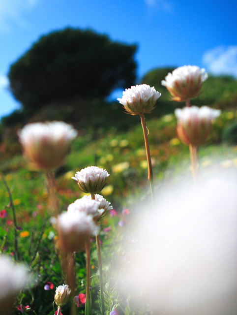
I fall into the camp of people who find the flower in foreground a bit distracting. I feel this way because I'm so interested in the great detail and gorgeous colors going on right behind it. I can't say enough about how much I like the range and vibrancy of the colors!
I do appreciate the unique approach at composition. The shape and scale of the flower in FG is repeated by the tree in BG which creates a sense of balance. As well as the diagonal placement of those elements, which makes a dynamic composition.
You have clearly striven to define BOKEH with this image; and although I'm not crazy about the white "blob", I do think you have succeeded. |
|
| Photographer found comment helpful. |
|
|
07/13/2006 07:43:01 PM |
| 4.86? You must be kiding me. GOD the people on this website....honestly....should have done wayyyy better. |
|
| Photographer found comment helpful. |
Comments Made During the Challenge  |
|
|
06/27/2006 07:10:29 PM |
|
| Photographer found comment helpful. |
|
|
06/25/2006 02:13:35 AM |
| Nice image, but I find the flower in the foreground a bit distracting. |
|
| Photographer found comment helpful. |
|
|
06/24/2006 03:46:30 PM |
| the glare of the flower in lower right hand corner ruins this for me |
|
| Photographer found comment helpful. |
|
|
06/24/2006 03:31:00 PM |
| This would have been quite a bit better if you had perhaps bent the large flower whiteout in the very front foreground. It upsets the general flow of the image. |
|
| Photographer found comment helpful. |
|
|
06/24/2006 09:27:35 AM |
| The large white area in the foreground, distract me from the image.... |
|
| Photographer found comment helpful. |
|
|
06/24/2006 04:49:08 AM |
| This is grand colours and composition. |
|
| Photographer found comment helpful. |
|
|
06/23/2006 01:39:17 PM |
| This would be a really great picture if that distracting, white spot wasnt covering almost a third of it. |
|
| Photographer found comment helpful. |
|
|
06/23/2006 11:37:04 AM |
| See those bokhe of flowers a perfect match with the soul of the word and philosopy with the beauty of the art along with sensation.. |
|
| Photographer found comment helpful. |
|
|
06/23/2006 12:15:42 AM |
| love the depth of the elements. would have been even better if you could have gotten just one flower in focus, but nice shot |
|
| Photographer found comment helpful. |
|
|
06/22/2006 09:30:05 PM |
| The white blob in the foreground is distracting. |
|
| Photographer found comment helpful. |
|
|
06/22/2006 09:48:46 AM |
| The colours are beautiful, but I think the white in front, and the dark in the back are too large. |
|
| Photographer found comment helpful. |
|
|
06/22/2006 07:16:30 AM |
|
| Photographer found comment helpful. |
|
|
06/21/2006 10:32:26 PM |
| I think your did a good job. This is an image that takes a minute to take in. That is what makes it fun. I like how you messed around with the depth of field. |
|
| Photographer found comment helpful. |
|
|
06/21/2006 07:33:01 PM |
| if only that large white blob wasnt there on the right, its just too big...otherwise i like this picture! |
|
| Photographer found comment helpful. |
|
|
06/21/2006 12:38:07 PM |
| I love that you have blur interest in front and background. the prettiest part is the yellow, pink, and purple in the front/middle. I might try to get that big one on the right out of the frame because it is so large and takes up a lot of your real estate. The blurred left front (bottom corner) should be enough to create distance. |
|
| Photographer found comment helpful. |
|
|
06/21/2006 09:53:48 AM |
| The lower right hand corner is just too distracting. It keeps me from looking at the rest of the image. |
|
| Photographer found comment helpful. |
|
|
06/21/2006 01:33:58 AM |
| i gave this one a 10, because it was the only one of the hundreds of flower entries in this challenge that caught my eye. i think it actually was the unfocused flower in the bottom right corner that brings it together, the picture is perfect in its "imperfections" (unfocused areas). nice job! |
|
| Photographer found comment helpful. |
|
|
06/21/2006 01:05:38 AM |
| Very nice... both foreground and back. I like. |
|
| Photographer found comment helpful. |
Home -
Challenges -
Community -
League -
Photos -
Cameras -
Lenses -
Learn -
Help -
Terms of Use -
Privacy -
Top ^
DPChallenge, and website content and design, Copyright © 2001-2025 Challenging Technologies, LLC.
All digital photo copyrights belong to the photographers and may not be used without permission.
Current Server Time: 03/12/2025 12:40:53 PM EDT.