| Photograph Information |
Photographer's Comments |
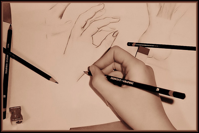
Challenge: Tools (Classic Editing*)
Camera: Kodak DC3200
Location: Melbourne, Australia
Date: Aug 26, 2003
Aperture: 3.6
ISO: 100
Shutter: 1/15
Galleries: Studio, Traditional Art
Date Uploaded: Aug 26, 2003
|
OK thats my hand, and my drawings. The drawings on the left are old, the naked one, is just something I did quickly last night so I would have a enough to scatter.
I desaturated all the color, making the image b&w, as well as playing with contrast (adding some) and darkening the brightness. Next I actually readded color with the curve. I know I could have desaturated most of color and played with hue to get a similar effect, but I had my reasons lol The photo is probably a little wasked out, and this technique improved on that slightly, while the other didn't. Next i used neat image, then sharpened. Cropped, added border, and there ya go. |
| Author | Thread |
|
|
09/03/2003 01:19:01 AM |
| Good work, loz, I like it... Congrats for a good average... |
|
 Photographer found comment helpful. Photographer found comment helpful. |
Comments Made During the Challenge  |
|
|
09/02/2003 11:46:52 PM |
| i like how the two hands connect. reminds me remotely of that Escher drawing. like the soft tones. nice smooth hand too. :o) |
|
| Photographer found comment helpful. |
|
|
09/02/2003 02:01:33 AM |
| Nice sepia tones. I would have liked to see more natural texture in the hand, but I like it very much. |
|
| Photographer found comment helpful. |
|
|
09/01/2003 02:52:33 AM |
| Very interesting! I like the use of a sepia-tone and the composition here. Having a drawn hand and a real hand really adds something to the photo. Nice job! |
|
| Photographer found comment helpful. |
|
|
08/29/2003 11:07:07 AM |
| The sepia creates a nice, soft tone. |
|
| Photographer found comment helpful. |
|
|
08/29/2003 06:48:07 AM |
| very good, a hand drawing a hand. A slightly more simple composition (some less pencils, remove the pad from underneath the hand), would have further strengthened the image in my opinion. 7 |
|
| Photographer found comment helpful. |
|
|
08/28/2003 04:15:21 PM |
| Reminds me of my father the commercial artist. I like it... |
|
| Photographer found comment helpful. |
|
|
08/28/2003 12:00:29 PM |
| nice composition and photo |
|
| Photographer found comment helpful. |
|
|
08/28/2003 01:21:22 AM |
| Pretty good... what would have been better is the drawing being a sketch of your real hand holding the pencil. That would be GREAT. Good job. |
|
| Photographer found comment helpful. |
|
|
08/27/2003 08:54:20 PM |
| Good shot, not sure about the desaturation though.. |
|
| Photographer found comment helpful. |
|
|
08/27/2003 02:19:11 PM |
| How odd.. and picture of a hand drawing a hand. Maybe you could do one of a hand drawing a hand drawing a hand drawing a hand, and so on |
|
| Photographer found comment helpful. |
|
|
08/27/2003 12:15:22 PM |
| I like how the whole thing is in skin tone. |
|
| Photographer found comment helpful. |
|
|
08/27/2003 12:12:43 PM |
| This is a fantastic composition but over reduction of noise / smart blur gives the hand a plastic look also the edges of the pencils show jaggedness - would like to see outtakes |
|
| Photographer found comment helpful. |
|
|
08/27/2003 10:39:57 AM |
| this gets cluttered to my eye - the pencil on the right seems redundant and the shadow below the hand detracts |
|
| Photographer found comment helpful. |
|
|
08/27/2003 12:52:57 AM |
| Excellent composition,beautiful light and contrast,perfect 10 from me! |
|
| Photographer found comment helpful. |
Home -
Challenges -
Community -
League -
Photos -
Cameras -
Lenses -
Learn -
Help -
Terms of Use -
Privacy -
Top ^
DPChallenge, and website content and design, Copyright © 2001-2025 Challenging Technologies, LLC.
All digital photo copyrights belong to the photographers and may not be used without permission.
Current Server Time: 03/14/2025 09:23:44 AM EDT.