| Author | Thread |
Comments Made During the Challenge  |
|
|
07/04/2006 07:31:02 PM |
|
|
|
07/04/2006 05:14:00 PM |
| looks a little bluegreen to me |
|
|
|
07/04/2006 07:24:55 AM |
|
|
|
07/04/2006 05:56:48 AM |
|
|
|
07/04/2006 03:53:07 AM |
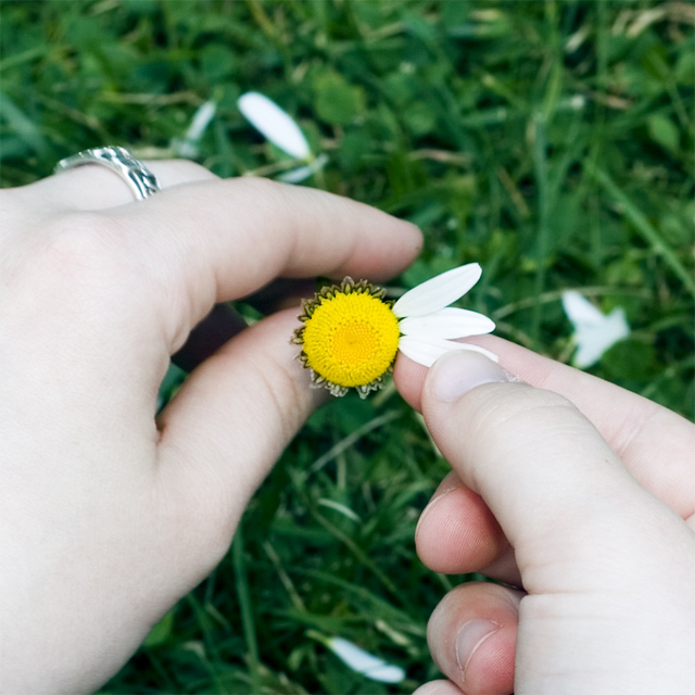
| The skin is a little overblown IMO. Otherwise a nice idea well executed. |
|
|
|
07/03/2006 08:25:31 PM |
Meets Challenge: 1/1
Lighting: 0/2
Focus: 1/2
Creativity: 2/2
Aesthetics: 2/3
Would have received a better score if the daisy and hands were not a little blown out with exposure. Best example of this "urban myth" so far. |
|
|
|
07/02/2006 03:29:54 PM |
| I think that the perspective here has distorted the hands, and this distracts from the flower. Taken from a different angle would work better, in my opinion. The lighting is also a bit too bright, it takes details away. I like the concept. |
|
|
|
07/02/2006 12:27:28 PM |
| The highlights are a little blown out but I like the centered composition and DoF. |
|
|
|
07/02/2006 02:20:55 AM |
| Nahh...he loves ya...course he does. Good work. |
|
|
|
06/30/2006 02:15:40 PM |
| The hands are just a wee bit too exposed. I like the DOF and the yellow came out great. |
|
 Photographer found comment helpful. Photographer found comment helpful. |
|
|
06/29/2006 07:15:26 PM |
| Best one of the daisy shots I've seen. |
|
| Photographer found comment helpful. |
|
|
06/29/2006 06:45:57 PM |
|
|
|
06/29/2006 12:12:13 PM |
| Hands seem a bit overexposed, but very nice effort. |
|
| Photographer found comment helpful. |
|
|
06/29/2006 10:36:02 AM |
| I'd have been tempted to remove the ring. But then again, some rings are hard to remove. Nice simple image which fits the bill. 7. |
|
| Photographer found comment helpful. |
|
|
06/29/2006 02:33:24 AM |
| Probably would of looked better without so much of the hands.. |
|
|
|
06/29/2006 02:22:13 AM |
| Crisp, good color. The position of the hands doesn't make for a full feeling when centered on the flower. |
|
| Photographer found comment helpful. |
|
|
06/28/2006 11:42:18 PM |
|
| Photographer found comment helpful. |
|
|
06/28/2006 05:57:43 PM |
|
| Photographer found comment helpful. |
|
|
06/28/2006 03:22:47 PM |
| Nice detail and depth of field. :) However, I think I would have scored it even higher if the main subject of the photo wasn't centered in the frame. |
|
| Photographer found comment helpful. |
|
|
06/28/2006 02:52:48 PM |
| the lighting seems a bit bright. i like the composition a lot though. |
|
|
|
06/28/2006 11:56:12 AM |
| To much which space on the hands. Maybe a closer view where the flower is 3/4 of the frame with only the finger tips exposed. |
|
|
|
06/28/2006 11:34:07 AM |
| i think a few more petals should have been left on the flower. but this was probably your vision, so good job. |
|
|
|
06/28/2006 09:14:50 AM |
| Hand lighting is "off" to me. Blown out a bit, especially in bottom right. |
|
|
|
06/28/2006 08:42:13 AM |
| I like the pedals in the background. |
|
|
|
06/28/2006 01:06:33 AM |
| Nice composition and DOF. Too bad the hands are so washed out. |
|
|
|
06/28/2006 12:59:11 AM |
| Cute idea... :) So, does he love you? |
|
Home -
Challenges -
Community -
League -
Photos -
Cameras -
Lenses -
Learn -
Help -
Terms of Use -
Privacy -
Top ^
DPChallenge, and website content and design, Copyright © 2001-2025 Challenging Technologies, LLC.
All digital photo copyrights belong to the photographers and may not be used without permission.
Current Server Time: 03/14/2025 01:37:51 AM EDT.