| Author | Thread |
|
|
07/11/2006 01:25:08 AM |
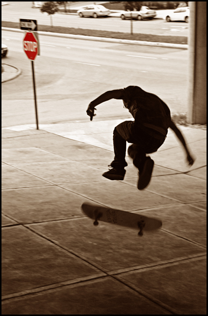
| My giving you a critique is like the student correcting the professor...it is seldom warranted. Be that as it may, I will add my 2 cents: I like the stop sign in red and everything about the skate board and rider...the blur is fine. The only thing I might suggest is to crop the line of cars out of the picture at the top and the front of the car on the left. This would mean the stop sign is pretty close to the edge and the one way sign might be cropped out altogether. But when I simulate the crop this way it makes for a cleaner picture and I prefer it that way. |
|
 Photographer found comment helpful. Photographer found comment helpful. |
|
|
07/09/2006 04:30:19 PM |
I love the toning with the red sign, not too saturated...subtle reference to the "no skateboarding".
I know this wouldn't really be possible with the panning, but I wish the sign was sharper so the "one way" was more obvious.
The exposure seems spot on, and along with the toning gives it a very photojournalistic feel.
I think overall the photo "deserved" better, but I'm not really surprised of its score given the DPC audience |
|
| Photographer found comment helpful. |
|
|
07/07/2006 04:10:52 PM |
*Critique Club*
I like the duo tones on this shot very much. I think that the motion blur on the person and skate board are great, but the stop sign should have been sharp or cropped out of the image. It is the only "color" object in the shot and it draws the viewers attention away from the subject. Maybe even a landscape crop would have been better for this image. I do admire you for asking strangers if you can take thier photo, I never have the guts enough to do that! |
|
| Photographer found comment helpful. |
|
|
07/06/2006 12:17:47 AM |
Trading Post comment
I like the alternate, but I like this one much better. It has a very "skateboard" feel to it - the freedom and singleness that the activity seems to imply. I like the stop sign in red and everything else in brown. That could well be a statement, but it doesn't really say that for me - I just like the tonality of it. In scrolling back and forth to comment, it seems to me you could crop the top just down to where the cars are gone - puts the skateboarder even more into his world. Oh, and don't get hung up on scores - this is actually a pretty darn cool picture that requires more than the standard DPC 2 seconds. |
|
| Photographer found comment helpful. |
|
|
07/05/2006 03:53:29 PM |
You know what you are doing Tim, so I'll keep this brief. The picture would have scored a great deal better if the stop sign were sharp. I know that's small, but I fully believe if it were sharp you would have had a killer image here. I have it as a rule that if the object has writing on it it needs to be either totally sharp or totally out of focus. The eye HATES blurry writing. Hates it, my friend. You only made it worse with the selective desat drawing attention to the pictures deficit. ;)
Composition is excellent. I love the way the skater appears mainly frozen while the board is what is moving. That's a great touch in my opinion. |
|
| Photographer found comment helpful. |
|
|
07/05/2006 11:31:03 AM |
Trading post...
I didn't vote in this challenge but would have given it a 7. The stop sign is a big distraction, since it's the only thing that has color to it my eye keeps going there. The blur on the hand and foot are good, maybe a little subtle for the challenge. Overall, a nice image. |
|
| Photographer found comment helpful. |
|
|
07/03/2006 06:51:41 PM |
| I do like the stop sign in the shot and also the one-way sign pointing in the other direction. It just visually screams skateboarding not allowed. The motion blur was probably way too subtle for the challenge like how mine was. Another thing lacking is the color. I think it's fine but I made sure to boost the color that I did include in my entry because that just helps with voters but why am I telling you this? You've done better than I to date. :P |
|
| Photographer found comment helpful. |
Comments Made During the Challenge  |
|
|
07/02/2006 11:21:21 PM |
| Oly kick flip, haven't done one of those in years! Cool shot. |
|
| Photographer found comment helpful. |
|
|
07/02/2006 08:27:28 PM |
| When you leave the stop sign red and desaturate everything else, that is where I want to look, instead of at the skateboarder. |
|
| Photographer found comment helpful. |
|
|
07/02/2006 02:47:00 PM |
| pretty nice shot, i just don't like those color signs upper left hand corner. also pitty it's flatground. but overall, pretty much like it! |
|
| Photographer found comment helpful. |
|
|
07/02/2006 12:13:50 AM |
When I look at this shot, I can hear the skateboard as it clatters back to the ground. Very evocative.
Some of the background is a little distracting, though. Maybe it would have worked better if the stop-sign had been cropped out, for instance. I can see what you're trying to do with the stop-sign - with its touch-colour red and the title of the photo - but it isn't really adding to the scene for me. Maybe if the sign was in focus and more closely juxtaposed with the subject...
I'd have tried losing the stop-sign and some of the foreground pavement, but leaving the median-strip and parked cars as background, to impart the sense of "urban street scape".
But for all that, still very evocative. |
|
| Photographer found comment helpful. |
|
|
06/29/2006 09:56:37 PM |
| Very nice fozen -yet blurry enough - image! |
|
| Photographer found comment helpful. |
|
|
06/29/2006 01:26:00 AM |
0-2 Meets Challenge: 2
0-3 Technical Merit: 2
0-3 Creativity: 2
0-2 The Wow Factor: 1
Total = 7 |
|
| Photographer found comment helpful. |
|
|
06/28/2006 07:48:39 AM |
|
| Photographer found comment helpful. |
|
|
06/27/2006 10:29:00 PM |
| I would have gone to a 10 if the stop sign wasn't blurrred. I think that stop sign would have made it brilliant. good job. 9 |
|
| Photographer found comment helpful. |
|
|
06/27/2006 09:01:21 PM |
|
| Photographer found comment helpful. |
|
|
06/26/2006 07:48:09 PM |
| Tone of color matches the action shot nice |
|
| Photographer found comment helpful. |
|
|
06/26/2006 08:41:16 AM |
| I like the urban sense. The single red of the stop sign is nicely done and achieves an interesting look. The grid of the pavement/sidewalk adds nice texture to it. I like it. |
|
| Photographer found comment helpful. |
Home -
Challenges -
Community -
League -
Photos -
Cameras -
Lenses -
Learn -
Help -
Terms of Use -
Privacy -
Top ^
DPChallenge, and website content and design, Copyright © 2001-2025 Challenging Technologies, LLC.
All digital photo copyrights belong to the photographers and may not be used without permission.
Current Server Time: 03/12/2025 01:27:52 PM EDT.