| Author | Thread |
|
|
07/07/2006 01:03:46 PM |
*Critique Club*
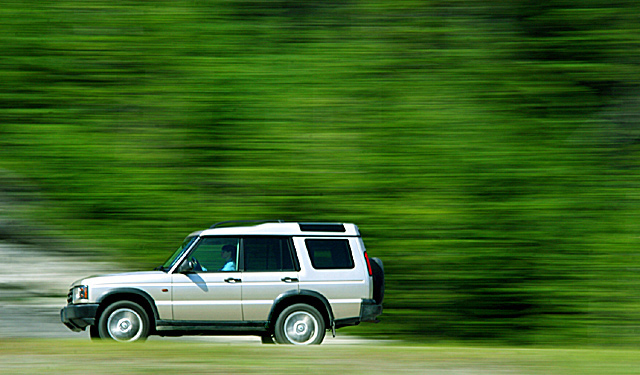
Put me in the group that thinks this is a great shot but would like to see the negative space in front of the vehicle.
The focus and clarity are really good here. I think you did a great panning job and the focus of the vehicle is very good, while the blurred background contrasts it perfectly. I like the patterns that the blur creates in the background. Color in the background is very nice as well.
Color on the vehicle however seems odd. There is a blue cast on the vehicle, and on the person as well. I could say 'oh, it's just their shirt' but it's their face that is blue too, and that strikes me as very odd. Actually, once I notice it (almost right away) it's where my attention is drawn every time, so it's a huge distraction for me.
Not sure what caused this blue tint, so not sure how to fix it other than going in and manually spot editing it to fix it.
The lighting is very good, I think the lighting is what really helps the focus to be right on and the vehicle to stand out so weel on the background.
You did a very nice job with this. The subject doesn't really make me jump out of me seat with excitement, however, technically, it's well done with the exception of the cropping/framing. This is all just my opinion of course.
~Heather~ |
|
 Photographer found comment helpful. Photographer found comment helpful. |
Comments Made During the Challenge  |
|
|
07/02/2006 07:05:45 PM |
| I like the texture the blur provides. |
|
| Photographer found comment helpful. |
|
|
07/02/2006 01:10:48 AM |
Nicely executed - rotational blur in the wheels, linear background blur, the car over to the right creating a sense of the camera struggling to keep up (even though you clearly weren't, judging by how crisp the car is).
Just not quite enough happening for my tastes. |
|
| Photographer found comment helpful. |
|
|
07/01/2006 07:56:23 AM |
| Very nicely captured...good clarity on the vehicle. |
|
| Photographer found comment helpful. |
|
|
06/29/2006 06:47:08 PM |
| good for a land rover ad! awesome backdrop... the green works great. the only thing i would suggest is having the car positioned in the right third of the frame. 7 |
|
| Photographer found comment helpful. |
|
|
06/29/2006 12:33:54 PM |
| boring subject but great blur! |
|
| Photographer found comment helpful. |
|
|
06/29/2006 02:54:55 AM |
| Classically speaking, there should be more negative space for the subject to move into rather than drive away from. |
|
| Photographer found comment helpful. |
|
|
06/27/2006 09:19:35 PM |
| Advertising cliche, but nevertheless, a fantastic image! Well done! |
|
| Photographer found comment helpful. |
|
|
06/27/2006 03:58:38 PM |
| I like the motion you showed. However I think the composition would be better with the car on the right side of the shot so it is driving into the picture instead of out of it. |
|
| Photographer found comment helpful. |
|
|
06/27/2006 03:37:38 AM |
| impressively sharp capture, and a great sense of movement too. let down slightly by the white triangle in the background bottom left - pity it wasn't green as well. but aside from that very good - nice sense of scale also from the way it's compoised / cropped. 8. |
|
| Photographer found comment helpful. |
|
|
06/26/2006 11:59:27 AM |
|
| Photographer found comment helpful. |
|
|
06/26/2006 07:12:19 AM |
| Would be better with the extra space in front |
|
| Photographer found comment helpful. |
|
|
06/26/2006 12:27:02 AM |
| Excellent Pan-- great colors 9!! |
|
| Photographer found comment helpful. |
Home -
Challenges -
Community -
League -
Photos -
Cameras -
Lenses -
Learn -
Help -
Terms of Use -
Privacy -
Top ^
DPChallenge, and website content and design, Copyright © 2001-2025 Challenging Technologies, LLC.
All digital photo copyrights belong to the photographers and may not be used without permission.
Current Server Time: 03/12/2025 01:27:19 AM EDT.