| Author | Thread |
Comments Made During the Challenge  |
|
|
07/04/2006 08:42:01 PM |
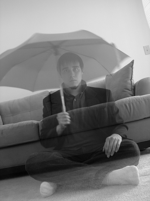
| i really like how the picture is on an angle. |
|
|
|
07/04/2006 02:40:28 PM |
Technical: Focus - 1
Exposure - 1
Quality - 1
Aesthetic: Comp. - 1
Light - 1
Color - 1
Wow Factor: 0
Personal Tilt: 1/3
What I liked: the idea, and it was well executed.
What I didn't like: Image lacks contrast. Seems fairly flat. |
|
|
|
07/04/2006 12:50:36 PM |
|
|
|
07/04/2006 04:13:45 AM |
| great imagery and creativity |
|
|
|
07/02/2006 03:00:35 PM |
| I like that it's slanted, it's like he's slipping right off the edge of the world. |
|
|
|
07/02/2006 11:31:23 AM |
| Lovely concept and execution |
|
|
|
07/02/2006 02:36:30 AM |
| Wonderful interpretation on the challenge. I like it. |
|
|
|
07/01/2006 08:37:32 AM |
|
|
|
06/30/2006 12:01:31 PM |
| I was going to do the whole ghost thing lucky I didnt >.> B&W works well here |
|
|
|
06/29/2006 07:35:52 PM |
I'm not sure what the title is referring to, honestly, but I like it. The tilt of the photo adds an extra sense of movement.
Well done. |
|
|
|
06/29/2006 07:14:27 PM |
|
|
|
06/29/2006 07:02:53 PM |
| Nice use of a long exposure. I think the tilted horizon line of the picture adds interest here, although I'm not sure about the composition, as the crop seems a little tight. |
|
|
|
06/29/2006 06:46:09 PM |
| I don't understand the umbrella... Great photo though -8 |
|
|
|
06/29/2006 03:01:41 PM |
| I really like this original idea and the angle of this shot. :) I think the black & white really helps add to the ghostly appeal. Nice job! |
|
|
|
06/29/2006 02:17:03 PM |
| Maybe a tighter crop? That light plug switch is unnecessary. But nice idea. Umbrella is a bizarre touch that I like. And the diagonal lines bring a bit of uneasiness. |
|
|
|
06/29/2006 10:05:40 AM |
|
|
|
06/29/2006 04:38:02 AM |
|
|
|
06/29/2006 02:19:33 AM |
|
|
|
06/28/2006 05:41:16 PM |
| Well done. 2 superstitions in 1, good idea. 7 |
|
|
|
06/28/2006 02:04:32 PM |
| the tilting is really distracting and i'm not sure what the connection between an open umbrella and a ghost may be. This would also be much better without the unclusion of the light switch. |
|
|
|
06/28/2006 01:32:25 PM |
| Nice concept and title. I like the fact that it's in black and white. Would've rather seen the entire umbrella in the picture, and also a little bit more contrast. |
|
|
|
06/28/2006 12:21:05 PM |
|
|
|
06/28/2006 11:01:02 AM |
| Crop out the left side to kill the light switch and white spot in the corner. They are a little distracting. Otherwise great image! |
|
|
|
06/28/2006 09:45:50 AM |
| The white thing and light switch on the right top is a distractent. The image is fairly well done. Not sure which UL it covers, I have heard many of lost souls but not one that sits in front of the couch with an umbrella. Maybe just trying for a superstion? it is confusing to me. |
|
Home -
Challenges -
Community -
League -
Photos -
Cameras -
Lenses -
Learn -
Help -
Terms of Use -
Privacy -
Top ^
DPChallenge, and website content and design, Copyright © 2001-2025 Challenging Technologies, LLC.
All digital photo copyrights belong to the photographers and may not be used without permission.
Current Server Time: 03/13/2025 04:15:41 PM EDT.