| Author | Thread |
Comments Made During the Challenge  |
|
|
07/04/2006 07:24:35 PM |
|
 Photographer found comment helpful. Photographer found comment helpful. |
|
|
07/04/2006 05:08:25 PM |
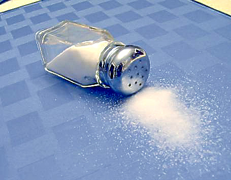
| Looks overprocessed to me, maybe just sharpening, but the back of the salt shaker is shoing some weird anomolies. The two tannish yellowish corners should be cut out of the shot. |
|
| Photographer found comment helpful. |
|
|
07/04/2006 02:36:11 PM |
Technical: Focus - 1
Exposure - 1
Quality - 0
Aesthetic: Comp. - 0
Light - 1
Color - 0
Wow Factor: 0
Personal Tilt: 1/3
What I liked: Reflection in the shiny shaker cap is cool. The blue is cool.
What I didn't like: Low image quality, the yellow in the corners is distracting |
|
| Photographer found comment helpful. |
|
|
07/04/2006 07:25:05 AM |
|
| Photographer found comment helpful. |
|
|
07/04/2006 06:01:07 AM |
|
|
|
07/02/2006 03:12:18 PM |
| The size of your image is way below the allowed 640 pixel and 150 MB limits. You should take advantage of the size allowed. The compression here has ruined an otherwise decent shot. There are tutorials for resizing your image in the "Learn" section of the top navigation bar. Good luck with your future challenges, keep shooting! |
|
| Photographer found comment helpful. |
|
|
07/02/2006 01:24:18 PM |
|
| Photographer found comment helpful. |
|
|
07/02/2006 02:25:48 AM |
|
| Photographer found comment helpful. |
|
|
07/01/2006 07:41:08 PM |
|
| Photographer found comment helpful. |
|
|
06/30/2006 05:43:13 PM |
| The composition is off. The top right and left corners in yellow are out of place. |
|
|
|
06/29/2006 07:20:57 PM |
Not very well executed. An actual shoulder in the photo might have given it more life. There was an entry using this superstition in the last Superstions challenge that placed in the top 5. Have a look at that one to see how effective it could have been.
As for your choice, you could have cropped closer - those top corners are very distracting. Also, the focus doesn't seem quite spot on. And there are some compression artifacts in the image. Maybe you didn't resize it properly? Or maybe the resolution of the camera was too low. |
|
|
|
06/29/2006 04:37:32 AM |
| Very out of focus and the collors are not tuned up |
|
| Photographer found comment helpful. |
|
|
06/29/2006 02:43:16 AM |
| It looks like you may have oversharpened a bit much? |
|
| Photographer found comment helpful. |
|
|
06/28/2006 10:12:57 PM |
| Nice idea, but I'd prefer to see the salt in better definition - since there is very little to look at in the picture, what there is needs to be attention-grabbing. Unfortunately the salt looks like a white blob mostly, with grainy bits around the edges. |
|
| Photographer found comment helpful. |
|
|
06/28/2006 06:46:51 PM |
| the yellow edges on the table don't really add anything compositionally. I think this would look better if you cropped them out. |
|
| Photographer found comment helpful. |
|
|
06/28/2006 05:40:32 PM |
| Too bad the picture is really too much compressed. It ruins the composition. 5 |
|
| Photographer found comment helpful. |
|
|
06/28/2006 05:14:56 PM |
| this looks quite over sharpened. |
|
| Photographer found comment helpful. |
|
|
06/28/2006 12:24:54 PM |
| I don't care for this at all, the yellow in the upper corners is a distracting, your reflection in the top is a distractent, the over blown salt is a distractant. Image just doesn't work. a tighter crop, better lighting, differnt background... |
|
|
|
06/28/2006 11:46:46 AM |
| I like the idea and execution is pretty good, but ... the yellow in the top corners is very distracting and really doesn't seem to add anything compositionally. Also seems like maybe it's a bit oversharpened or something. |
|
| Photographer found comment helpful. |
|
|
06/28/2006 09:13:45 AM |
| Wish the background was solid without the lines in both top corners. |
|
| Photographer found comment helpful. |
|
|
06/28/2006 08:24:32 AM |
|
Home -
Challenges -
Community -
League -
Photos -
Cameras -
Lenses -
Learn -
Help -
Terms of Use -
Privacy -
Top ^
DPChallenge, and website content and design, Copyright © 2001-2025 Challenging Technologies, LLC.
All digital photo copyrights belong to the photographers and may not be used without permission.
Current Server Time: 03/12/2025 05:20:23 PM EDT.