| Author | Thread |
Comments Made During the Challenge  |
|
|
07/04/2006 02:33:59 PM |
Technical: Focus - 1
Exposure - 1
Quality - 1
Aesthetic: Comp. - 1
Light - 0
Color - 1
Wow Factor: 0
Personal Tilt: 1/3
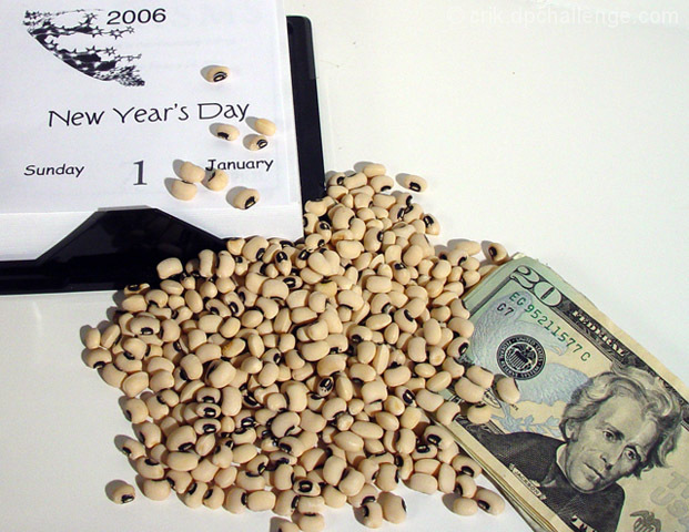
What I liked: Blackeyed peas, $20, new years. Haha, also, I like the composition with the negative space in the upper right.
What I didn't like: Subject isn't very enthralling, and the paper is a different shade of white than the background was. Light seems fairly flat. |
|
 Photographer found comment helpful. Photographer found comment helpful. |
|
|
07/04/2006 04:11:40 AM |
| love the composition and creativity |
|
| Photographer found comment helpful. |
|
|
07/02/2006 04:09:40 PM |
| I really like this photo, it fits in perfect with this challenge. My mother-in-law is a stickler for this superstition. |
|
| Photographer found comment helpful. |
|
|
07/02/2006 02:41:53 AM |
| Oh....this is a new one to me...good work putting it together. |
|
| Photographer found comment helpful. |
|
|
07/01/2006 09:50:25 PM |
| This is a fun idea. Your lighting is quite strong and even. Perhaps a bit too much negative space top right. Some is fine, maybe if you had fanned the bills a little? Good luck in the challenge. |
|
| Photographer found comment helpful. |
|
|
07/01/2006 11:20:39 AM |
| That's one I hadn't heard of. When I read "black-eyed peas" I assume it's a Southern superstition. Is that right? |
|
| Photographer found comment helpful. |
|
|
06/30/2006 02:03:07 PM |
| Interesting superstition, I might have to give this one a try. As for the photo it seems a little flat although brightly lit. Also, I don't feel the empty space in the top right adds anything to the photo, maybe if the bills had been fanned out to take up some more of the empty space. i do like how both the calendar and money run off the edges in opposite corners. |
|
| Photographer found comment helpful. |
|
|
06/30/2006 12:30:00 AM |
| you're obviously american and i've never heard that one before good show though |
|
| Photographer found comment helpful. |
|
|
06/29/2006 08:33:38 PM |
|
| Photographer found comment helpful. |
|
|
06/29/2006 03:36:59 PM |
| I honestly believe you can imrove this pic by changing the angle of your shot. A little to the right would have made the composition more interesting. :) |
|
| Photographer found comment helpful. |
|
|
06/29/2006 01:36:52 PM |
| True, it fits the challenge very well, but the image itself is very busy. |
|
| Photographer found comment helpful. |
|
|
06/28/2006 10:30:43 PM |
| Great idea, and lovely clarity on the beans |
|
| Photographer found comment helpful. |
|
|
06/28/2006 06:07:34 PM |
| The photo doesn't do much for me. Not much in the way of color. I think maybe a different setting would have been better. |
|
| Photographer found comment helpful. |
|
|
06/28/2006 02:56:33 PM |
|
| Photographer found comment helpful. |
|
|
06/28/2006 01:34:13 PM |
| Good concept.. But I don't have a 'wow' factor. |
|
| Photographer found comment helpful. |
|
|
06/28/2006 12:26:46 PM |
| Good - I think a more interesting composition with lines or features that lead ones eye around the frame could help. |
|
| Photographer found comment helpful. |
|
|
06/28/2006 12:07:34 PM |
| Very cute, maybe spread the money out a little bit more... but the background is very distracting with the uneven lighting and the blowout and discolour. |
|
| Photographer found comment helpful. |
|
|
06/28/2006 11:21:42 AM |
LOL
GOod ol' hop'n'john for New Years.... woot |
|
| Photographer found comment helpful. |
|
|
06/28/2006 02:10:21 AM |
|
Home -
Challenges -
Community -
League -
Photos -
Cameras -
Lenses -
Learn -
Help -
Terms of Use -
Privacy -
Top ^
DPChallenge, and website content and design, Copyright © 2001-2025 Challenging Technologies, LLC.
All digital photo copyrights belong to the photographers and may not be used without permission.
Current Server Time: 03/12/2025 03:41:53 PM EDT.