| Author | Thread |
|
|
07/05/2006 07:17:40 PM |
| Congratulations on your top 20 finish. Very nice shot! |
|
|
|
07/05/2006 03:30:46 AM |
Man some people just have to give ya some shitty critiques dont they?
Love the gray tone on the skin. Do you have a formula for achieving this in PS? or is it just trial and error? It looks a bout 13% - 18% gray and quite a level tonal range.
Cheers
Tim |
|
Comments Made During the Challenge  |
|
|
07/04/2006 11:57:10 AM |
Technical: 3/3
Aesthetic: 3/3
Personal Tilt: 2/3
Wow!: 0/1 |
|
|
|
07/03/2006 09:43:42 PM |
| I would like to know how you did this image. |
|
|
|
07/03/2006 08:15:19 PM |
Meets Challenge: 1/1
Lighting: 2/2
Focus: 2/2
Creativity: 1/2
Aesthetics: 1/3
I would have rated this photo an 8 or a 9 if it weren't for the desaturation of everything but green. It's a good use of the technique, but I don't like it at all, which is what resulted in the low aesthetics score. This is a personal preference, however. |
|
|
|
07/02/2006 02:33:35 AM |
| Good desat work....beautiful clarity. |
|
|
|
07/01/2006 11:38:56 AM |
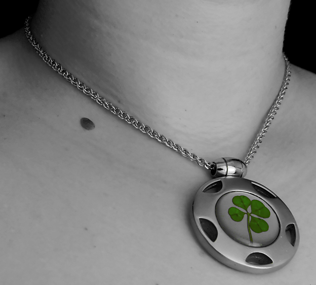
| Validated? I wonder why it would have been challenged. Is that a real four-leaf clover preserved in glass? Cool. Nice crisp image. Even the chain is sharpened just rght. |
|
|
|
07/01/2006 10:10:55 AM |
| Nice use of colour on monochrome. |
|
|
|
06/30/2006 01:48:31 PM |
| Good picture, though how did you keep the clover green with basic editing? I see your picture has been validated - really interested to know how you did this. Well done. |
|
|
|
06/30/2006 12:09:35 PM |
| The mole is a lil distracting... |
|
|
|
06/29/2006 10:33:26 PM |
| gorgeous shot. great use of selective desat. hope this does well!! |
|
|
|
06/29/2006 07:11:53 PM |
| cool idea. i like the softness of the skin and the composition. this definietly would not be as powerful without the selective desat. great joB! 7 |
|
|
|
06/29/2006 01:50:42 PM |
| Very nice piece of jewelry and good picture. However i think desat is not authorized for basic editing. Too bad... 6 |
|
|
|
06/29/2006 07:05:34 AM |
| nice clarity, but I am not sure your selective desaturation is in the rules... |
|
|
|
06/29/2006 02:24:48 AM |
| Gorgeous on the medallion. |
|
|
|
06/28/2006 10:18:45 PM |
|
|
|
06/28/2006 06:16:49 PM |
| quite a fine pendant, and a nice shot as well. |
|
|
|
06/28/2006 04:33:11 PM |
| I really like the use of desaturation in this shot. :) The only thing I possibly would have done different is to lighten and saturate the green clover to help it "pop" a little more. |
|
|
|
06/28/2006 02:35:19 PM |
| Nice idea, pretty pendant. The photo feels a bit flat, it could do with a bit more "oooompf" (contrast etc). 7 |
|
|
|
06/28/2006 01:56:25 PM |
Very nice, simple picture.
I really like the necklace too. It's pretty |
|
|
|
06/28/2006 12:19:22 PM |
| Pretty image. nice tones and highlights are not blown out. |
|
|
|
06/28/2006 11:35:13 AM |
|
|
|
06/28/2006 10:22:27 AM |
| This photo is beautifully done. 9 |
|
|
|
06/28/2006 08:32:28 AM |
| Sorry but the mole is incredibly distracting. This should have been shot from her left to minimize it. |
|
Home -
Challenges -
Community -
League -
Photos -
Cameras -
Lenses -
Learn -
Help -
Terms of Use -
Privacy -
Top ^
DPChallenge, and website content and design, Copyright © 2001-2025 Challenging Technologies, LLC.
All digital photo copyrights belong to the photographers and may not be used without permission.
Current Server Time: 12/14/2025 07:30:55 PM EST.