| Author | Thread |
Comments Made During the Challenge  |
|
|
07/11/2006 08:56:59 AM |
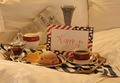
| The view from having one's chin resting on the paper? It seems crowded, but at least is stationery. |
|
 Photographer found comment helpful. Photographer found comment helpful. |
|
|
07/10/2006 01:00:08 PM |
| Very nice, would like to see writing be darker so as to junp out a bit more. Overall impression is not enough contrasts between grays, but do like the shot |
|
| Photographer found comment helpful. |
|
|
07/09/2006 10:04:55 PM |
| very flat image text should be in focus for me. |
|
| Photographer found comment helpful. |
|
|
07/07/2006 05:45:32 PM |
| dont see what the photo is supposed to convey. the title doesnt help indefining that either |
|
|
|
07/07/2006 03:11:54 PM |
|
| Photographer found comment helpful. |
|
|
07/07/2006 09:31:21 AM |
| A nice image but could use a little more contrast for my taste. The softness of this image doesn't really work due to the lack of contrast. The grain look is very effective. |
|
| Photographer found comment helpful. |
|
|
07/06/2006 11:40:30 PM |
| I like the softness and the tones. it would be a better picture if the writting was more in focus and the pen were more out of focus. |
|
| Photographer found comment helpful. |
|
|
07/06/2006 07:55:58 PM |
| Nice grey tones. Focus is good. |
|
| Photographer found comment helpful. |
|
|
07/06/2006 06:19:55 AM |
|
| Photographer found comment helpful. |
|
|
07/06/2006 02:48:30 AM |
| I love the simplicity and the texture here. |
|
| Photographer found comment helpful. |
|
|
07/05/2006 11:33:15 AM |
| A little too out of focus for me... |
|
| Photographer found comment helpful. |
Home -
Challenges -
Community -
League -
Photos -
Cameras -
Lenses -
Learn -
Help -
Terms of Use -
Privacy -
Top ^
DPChallenge, and website content and design, Copyright © 2001-2025 Challenging Technologies, LLC.
All digital photo copyrights belong to the photographers and may not be used without permission.
Current Server Time: 03/12/2025 10:06:24 AM EDT.