| Author | Thread |
Comments Made During the Challenge  |
|
|
07/11/2006 07:20:49 AM |
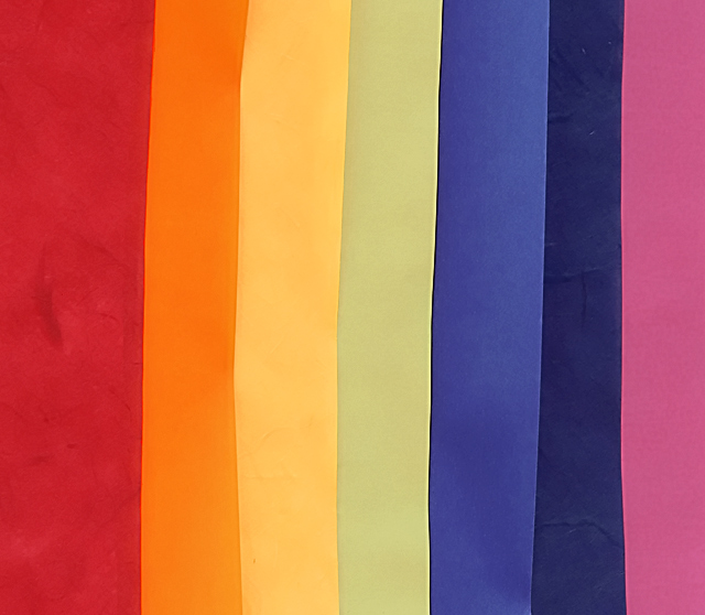
| Nooooo.... this is very unclear to me what is being depicted. It may well be stationery, and it is very clear and colorful, but it looks more like a TV station "Off the Air" pattern!!! |
|
 Photographer found comment helpful. Photographer found comment helpful. |
|
|
07/10/2006 08:29:40 AM |
| the non-uniform widths are making this image great |
|
| Photographer found comment helpful. |
|
|
07/07/2006 11:43:44 AM |
What I like: let me think about this... The color! And the vertical lines are pleasant.
What might improve it: if you cut all of the paper at once so that you had perfectly aligned edges. then if you cut them all with some shape instead of straight, that might lead to a pleasant effect too. |
|
| Photographer found comment helpful. |
|
|
07/07/2006 09:28:50 AM |
| A nice piece of abstract art. Basic editing hurts you a little here, as the dark spot on the far left could not be cloned out. |
|
| Photographer found comment helpful. |
|
|
07/07/2006 12:05:26 AM |
|
| Photographer found comment helpful. |
|
|
07/06/2006 08:16:11 PM |
| the lines need to be crisp, and the paper should not have wrinkles. This is a good idea, but needed to be set up a bit more carefully. |
|
|
|
07/06/2006 06:59:25 PM |
| Lighting is flat. A bump in saturation and some added contrast would also improve this photo. |
|
| Photographer found comment helpful. |
|
|
07/06/2006 06:59:29 AM |
| A rainbow of colours. Nicely laid out. |
|
| Photographer found comment helpful. |
|
|
07/05/2006 05:13:39 PM |
| Need more on the composition. |
|
|
|
07/05/2006 10:39:52 AM |
|
| Photographer found comment helpful. |
|
|
07/05/2006 12:55:27 AM |
| Nice simple idea, that works well... I also like the color combination that you chioose. |
|
| Photographer found comment helpful. |
Home -
Challenges -
Community -
League -
Photos -
Cameras -
Lenses -
Learn -
Help -
Terms of Use -
Privacy -
Top ^
DPChallenge, and website content and design, Copyright © 2001-2025 Challenging Technologies, LLC.
All digital photo copyrights belong to the photographers and may not be used without permission.
Current Server Time: 03/12/2025 03:48:04 PM EDT.