| Author | Thread |
Comments Made During the Challenge  |
|
|
07/11/2006 05:37:25 PM |
Nice idea. :)
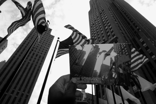
I lost the postcard in the background, though. If you can, try reshooting it with the postcard against the plain sky or against a darker building, but not across building boundaries. |
|
 Photographer found comment helpful. Photographer found comment helpful. |
|
|
07/11/2006 07:30:09 AM |
| Nice composition of a clever idea. i suppose a post card is a type of stationery. OK. |
|
| Photographer found comment helpful. |
|
|
07/10/2006 12:24:09 PM |
| very nice photo, however dnmc imo |
|
| Photographer found comment helpful. |
|
|
07/08/2006 03:34:12 PM |
| Nice idea for the challenge - would like to see more contrast. |
|
| Photographer found comment helpful. |
|
|
07/07/2006 11:37:01 AM |
What I like: Original idea, well implemented! Nice DOF, I'm looking forward to seeing what your Aperature and Shutter speed was.
What might improve it: Only one thing and it would have been a wider angle lense. Yeah, the one thing that haunts the digital camera.
Well done! This gets a high score from me! |
|
| Photographer found comment helpful. |
|
|
07/07/2006 10:12:26 AM |
Clever idea. It takes some time for it to make an impact. But the more I look at it the more I like it.
Isn't it interesting how once the plaza had space for a numer of international flags but now its dozens of flagpoles fit only American ones? |
|
| Photographer found comment helpful. |
|
|
07/07/2006 09:33:12 AM |
| Wow, you chose some tough lighting conditions to shoot under. At first I wondered if a post card was really stationery but since you can write a message on the back it certainly is. I don't think the black and white conversion works with this photo. Maybe more contrast would help but I'm willing to bet that the post card would suffer greatly. |
|
| Photographer found comment helpful. |
|
|
07/06/2006 08:07:22 PM |
Yes you were.
The left tilt perspective of the building and the right-tilt perspective on the card is a bit disturbing. |
|
| Photographer found comment helpful. |
|
|
07/06/2006 07:15:56 PM |
|
| Photographer found comment helpful. |
|
|
07/06/2006 09:24:04 AM |
| Thats cool... a little dark, but good! |
|
| Photographer found comment helpful. |
|
|
07/06/2006 07:01:40 AM |
|
| Photographer found comment helpful. |
|
|
07/06/2006 06:17:26 AM |
| Very clever idea and angle. |
|
| Photographer found comment helpful. |
|
|
07/05/2006 11:00:49 PM |
| Would have loved to have seen this in color. Cool how you were there and had those two images together, but IMO, the B&W turns the sky too bright to appreciate what is actually being portrayed here. |
|
| Photographer found comment helpful. |
|
|
07/05/2006 09:20:27 PM |
| Photo does not fit catagory. |
|
| Photographer found comment helpful. |
|
|
07/05/2006 02:17:02 PM |
|
| Photographer found comment helpful. |
|
|
07/05/2006 09:13:32 AM |
| so was I last year...this is nice, but lacks contrast...not sure that the exposure is right, but nice idea |
|
| Photographer found comment helpful. |
|
|
07/05/2006 09:03:24 AM |
| You should make this a postcard for sure. |
|
| Photographer found comment helpful. |
|
|
07/05/2006 01:07:50 AM |
| Hard to work out what one is looking at.....Yes I see that it is a postcard but it really very hard to see that..... |
|
| Photographer found comment helpful. |
Home -
Challenges -
Community -
League -
Photos -
Cameras -
Lenses -
Learn -
Help -
Terms of Use -
Privacy -
Top ^
DPChallenge, and website content and design, Copyright © 2001-2025 Challenging Technologies, LLC.
All digital photo copyrights belong to the photographers and may not be used without permission.
Current Server Time: 03/12/2025 07:55:24 AM EDT.