| Author | Thread |
Comments Made During the Challenge  |
|
|
07/28/2002 02:07:00 PM |
| Wow how did he do that :S |
|
|
|
07/28/2002 10:45:00 AM |
| Upper half a little bright for me. |
|
|
|
07/27/2002 12:06:00 AM |
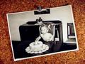
| Light sorce seems to harsh, the shadow hides the texture of the lower quarter while the glare burned out the texture for the top one. The ridge would have been great, but it was outside the dof. Nice concept though. |
|
|
|
07/26/2002 02:40:00 PM |
| Reflective surfaces are soooooo hard to do well. You have an awesome idea here, and the background, though busy, adds another layer of texture. I think if you were to redo this shot, you should try it so that the light doesn't cast a shadow over the lower quarter. Maybe use two or three lights at different points so that shadows are eliminated. Secondly, and this is just a thought, use Ohio and NC's quarter because there have been "debates" over which is really the "First in Flight" state. karmat |
|
|
|
07/26/2002 01:32:00 PM |
| It could be the flash glare (too strong!), but it seems out of focus, too. The shadow at the bottom of the frame...why? Upright coin way out of focus, this needs a much wider depth of field. South Carolina is hard to see, too. Texture is there, of course, but not well demonstrated. Sorry, but I convinced myself to lower your score from 6 to 5. Swash |
|
|
|
07/26/2002 10:32:00 AM |
| Poorly lit, too much from the top, and too little on the bottom. You need more DOF as well to make the upright quarter in focus. Finally I would'ved rotated the quarters so they went from left to right to fill the frame more. |
|
|
|
07/25/2002 08:07:00 PM |
| You got too much light on the top coin. |
|
|
|
07/25/2002 01:34:00 PM |
| Not enough tonal contrast between the coins and the cloth. Top right is light and bottom left is dark; should have been the other way around, methinks. Coins are out of focus. |
|
|
|
07/25/2002 04:06:00 AM |
| I'd have tried for more even lighting (but probably not succeeded). |
|
|
|
07/24/2002 05:19:00 PM |
| This is too light, lacks interest and is not properly focused. It is very pixelated, you might want to check into that. |
|
|
|
07/24/2002 12:11:00 PM |
| there's a new take on texture that i didn't think of, interesting. quarters certainly do have texture. the execution of the photo could be a little better, your file size is only 1/3 of what's allowed and that shows in the pixelation. the lighting is uneven (darker in the LL corner) and the shadow doesn't add anything here. maybe two light sources? most of all, the photo isn't quite sharp, and that's pretty important for many textures. -- gr8photos (3) |
|
|
|
07/24/2002 09:26:00 AM |
| poor lighting and off focus |
|
|
|
07/24/2002 12:24:00 AM |
| You have a good idea, but the background texture and the top coin is way too much over exposed. |
|
|
|
07/23/2002 01:58:00 PM |
|
|
|
07/23/2002 02:44:00 AM |
| the flash is a bit harsh on the top quarter, could you have done this by opening your fstop, expanding your shutter speed, etc... |
|
|
|
07/22/2002 10:05:00 PM |
| Lighting is very harsh - I can't make out half of the Ohio quarter. |
|
|
|
07/22/2002 10:03:00 PM |
| flash should be positioned more to side and at angle so not to reflect directly into the lens |
|
|
|
07/22/2002 07:38:00 PM |
| I like your idea, but your lighting is not that flattering to the coins. You really captured some interesting textures! |
|
|
|
07/22/2002 06:49:00 PM |
| Light is too bright. Is the subject the quarters or background? |
|
|
|
07/22/2002 03:32:00 PM |
| I think a different angle would have helped here... the quarters are only slightly off center... this is a bit distracting... maybe if you had centered and turnd this stack 45 degrees to the right, it would have punched a little harder... = 5 - jmsetzler |
|
|
|
07/22/2002 02:50:00 PM |
.
Message edited by author 2003-09-19 03:08:44. |
|
|
|
07/22/2002 12:03:00 PM |
| Light is too hot here, must of been that background. Cool perspective all the same. Kee |
|
|
|
07/22/2002 08:41:00 AM |
| Good photo. Kind of hard to balance the lighting on metal isn't it? |
|
|
|
07/22/2002 06:46:00 AM |
| haha I'm starting to apreciate this semi-amateur mood. very daring |
|
|
|
07/22/2002 01:07:00 AM |
| world've been great without the shadow |
|
Home -
Challenges -
Community -
League -
Photos -
Cameras -
Lenses -
Learn -
Help -
Terms of Use -
Privacy -
Top ^
DPChallenge, and website content and design, Copyright © 2001-2025 Challenging Technologies, LLC.
All digital photo copyrights belong to the photographers and may not be used without permission.
Current Server Time: 03/13/2025 03:45:09 PM EDT.