| Author | Thread |
Comments Made During the Challenge  |
|
|
07/27/2002 10:57:00 PM |
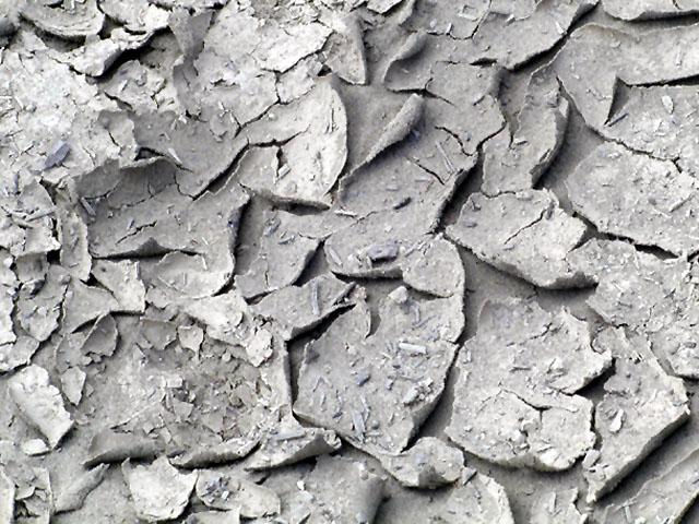
| Geeeee that is interesting ground. Looks like clay. Very good photograph. It leaves no doubt about the texture. |
|
|
|
07/27/2002 03:11:00 PM |
This is a great photo. I feel as if I should not walk there in bare feet as the earth has dried so hard and thin, it may be sharp. The focus is great as well as the cropping. One thing...what about a lower angle? - just a thought. 9
Ruthann |
|
|
|
07/27/2002 05:22:00 AM |
| Good move in making this mostly monotone (some blue tones still there?). Feels dry. |
|
|
|
07/26/2002 05:03:00 PM |
| Even lighting, excellent texture, I like this. Makes me feel like I'm there. |
|
|
|
07/26/2002 06:37:00 AM |
|
|
|
07/25/2002 09:54:00 AM |
| this is a good idea for the challenge, however, the shot doesn't seem to be quite in focus and therefore the texture doesn't pop out as much as it could. -- gr8photos (4) |
|
|
|
07/25/2002 04:12:00 AM |
| I don't think I've seen dried mud like that since grade school. I think if I were going grayscale I'd have made it darker overall. |
|
|
|
07/24/2002 04:53:00 PM |
Composition9
Originality8
Technical Aspects8
Meets Challenge9
Total Score9
For those that are just learning, like me.
Composition: Scoring in this area is based on basic composition of a picture and includes the rule of thirds, balance, cropping, and curved and diagonal lines. Subject matter that does not lend itself to the picture or otherwise unwanted is also considered here.
Originality: Scoring in this area is based on pictures or concepts that I have seen, as well as how much effort you have invested in the picture. Usually a little something that sets it aside from a snapshot. Does it make me want to come back for another look? You know things like that.
Technical Aspects: Focus, exposure, lighting, and other special effects (done by the camera), and post processing are all considered in this category.
Meets Challenge: This is based on my interpretation of if you, have/have not, met the challenge. This is fairly simple but quite important for this site.
There are many sites that can give you assistance in achieving better skills in photography, but I think the best way to learn is to take pictures and show them to other people. Believe me when it is a good one you will know it.
Good luck!
Autool
|
|
|
|
07/24/2002 12:54:00 AM |
| Boy, that really is texture! Your photo would have had more power if it had more contrast. It looks a bit over sharpened also. |
|
|
|
07/23/2002 03:26:00 AM |
| this is a great idea for a texture, and well executed. you might try including some sort of center of interest, though, because the texture itself isn't enough to carry the whole shot. |
|
|
|
07/23/2002 01:11:00 AM |
|
|
|
07/22/2002 09:29:00 PM |
| Nice capture of texture. I think you've also used what shadows were available well; it gives it more depth. karmat |
|
|
|
07/22/2002 08:13:00 PM |
| good texture, but the subjectmatter isnt interesting |
|
|
|
07/22/2002 06:26:00 PM |
| Nice for B&W. Soft focus. |
|
|
|
07/22/2002 06:19:00 PM |
| subtle colour variation and good composition |
|
|
|
07/22/2002 03:40:00 PM |
|
|
|
07/22/2002 02:44:00 PM |
| I probably like this because it's something I don't normally see in my part of the country, but I would have preferred this with a bit more color..I can't even tell if you've toned it to B&W or not. |
|
|
|
07/22/2002 12:36:00 PM |
| perfect exposure, great way to emphasize heat. |
|
|
|
07/22/2002 10:22:00 AM |
| I think leveling is needed to bring out the contrasts. Right now everything is blended together. It's also too bright. |
|
|
|
07/22/2002 09:32:00 AM |
| Not having seen the original, Im not sure if black and white bud is better than colored mud. |
|
|
|
07/22/2002 09:07:00 AM |
| Needs just a bit more contrast--just my take.Otherwise good one. |
|
Home -
Challenges -
Community -
League -
Photos -
Cameras -
Lenses -
Learn -
Help -
Terms of Use -
Privacy -
Top ^
DPChallenge, and website content and design, Copyright © 2001-2025 Challenging Technologies, LLC.
All digital photo copyrights belong to the photographers and may not be used without permission.
Current Server Time: 03/14/2025 03:37:21 PM EDT.