| Author | Thread |
Comments Made During the Challenge  |
|
|
07/18/2006 04:22:12 PM |
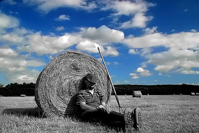
| Nice photo. Selective desat seems a bit unnecessary though. |
|
 Photographer found comment helpful. Photographer found comment helpful. |
|
|
07/18/2006 04:15:46 PM |
| Great picture, as simple as that. |
|
| Photographer found comment helpful. |
|
|
07/18/2006 12:33:25 PM |
| I'm sure this pic would have worked even without the selective destat.. still good work |
|
| Photographer found comment helpful. |
|
|
07/18/2006 11:18:12 AM |
| OOOOOOOHHHHHH 10 10 10 10 10 10. I love photots like these ther're so fantastic! I can never seem to master them. Any tips? |
|
| Photographer found comment helpful. |
|
|
07/18/2006 09:36:40 AM |
| Sorry, have never really been a fan of selective desat and especially when I don´t see it having a purpouse and that is the case for me here, to me it seems the selective desat has no purpouse and I am 99% sure I would have liked the color version or a plain b/w version much better. Not a bad shot though, gave it a 5. |
|
| Photographer found comment helpful. |
|
|
07/18/2006 03:40:45 AM |
| the color looks so great in the sky i kinda wish that you hadn't used either ifrared or color desaturation, a good example of progress though |
|
| Photographer found comment helpful. |
|
|
07/17/2006 05:42:33 PM |
| I know you desaturated everything but the blue but I think it would look better if you had desaturated the blue a little. |
|
| Photographer found comment helpful. |
|
|
07/17/2006 05:13:57 PM |
| I love this fun enviro portrait! Fab use of PS tools! Great contrast between blue sky and B&W! |
|
| Photographer found comment helpful. |
|
|
07/16/2006 03:01:23 PM |
| This is my winner (I only pick one picture to give a 10 to). Most of the time, the B&W conversion with a spot of color is cheesy, but this picture does it well. I think it captures what summer progress is all about. I hope it does well and others agree this is the best. Good luck. |
|
| Photographer found comment helpful. |
|
|
07/15/2006 06:42:41 PM |
| It's a cool photo in a way but I don't see why you chose the edit you did. Part of the 'farmers' shoes are missing and I think that takes away from the photo. |
|
| Photographer found comment helpful. |
|
|
07/14/2006 11:39:22 PM |
| I'm not entirely sure, not being well-versed in agronomy, but I doubt the hay bales are rolled by one guy and a pitchfork. I could be wrong. Composition is quite nice, but I'd prefer it either all in color, or all in B&W. |
|
| Photographer found comment helpful. |
|
|
07/14/2006 04:53:04 PM |
| The desat works very well here. Love the sky and the whole scene. |
|
| Photographer found comment helpful. |
|
|
07/13/2006 10:26:19 PM |
| Sweet. Reminds me of a Van Gogh. I find myself wanting a little more detail in the figure...maybe more face detail, or maybe hands? |
|
| Photographer found comment helpful. |
|
|
07/13/2006 04:07:49 PM |
| Love the composition, content and lighting. Hate the selective desaturation, sorry. This would have been a 9 in colour or black and white. |
|
| Photographer found comment helpful. |
|
|
07/13/2006 02:01:29 PM |
|
| Photographer found comment helpful. |
|
|
07/13/2006 11:52:30 AM |
| Good idea with desaturation. Clouds looks really like painted. Pitty you cropped of the shoe. |
|
| Photographer found comment helpful. |
|
|
07/13/2006 08:06:25 AM |
| excellent ... a winner maybe ? i like it a lot |
|
| Photographer found comment helpful. |
|
|
07/13/2006 04:53:02 AM |
| Not sure if i'd have desaturated the lower half, as it adds an artificialness to an otherwise genuine image. Still an interesting photo though. |
|
| Photographer found comment helpful. |
|
|
07/13/2006 03:26:52 AM |
| Good work with the processing. |
|
| Photographer found comment helpful. |
|
|
07/12/2006 12:45:11 PM |
| Great composition, and excellent use of desaturation. :) |
|
| Photographer found comment helpful. |
|
|
07/12/2006 12:23:28 PM |
| Great selective desaturation, one of the best I've seen here in a long time! Composition is pretty good, I would suggest that you didn't crop / frame out the bottom of his boot. |
|
| Photographer found comment helpful. |
|
|
07/12/2006 05:45:41 AM |
| color processing takes away from the mood |
|
| Photographer found comment helpful. |
|
|
07/12/2006 01:58:14 AM |
|
| Photographer found comment helpful. |
|
|
07/12/2006 12:35:53 AM |
i am assuming the color sub emphasis is in camera, I haven't gotten mine to look that clean.
I like the like the shot. it's a nice contrast. |
|
| Photographer found comment helpful. |
Home -
Challenges -
Community -
League -
Photos -
Cameras -
Lenses -
Learn -
Help -
Terms of Use -
Privacy -
Top ^
DPChallenge, and website content and design, Copyright © 2001-2025 Challenging Technologies, LLC.
All digital photo copyrights belong to the photographers and may not be used without permission.
Current Server Time: 03/14/2025 09:33:44 AM EDT.