| Author | Thread |
|
|
07/20/2006 07:36:33 PM |
I'd be a little worried that Art was the first to post after the challenge. I can see him now manipulating this image... :P
Anyway, great idea here. I couldn't think of anything for this challenge so I went ahead and followed the herd over to perspective instead. :P
In terms of improvements, looks like you took care of little things in the re-edit, however I would probably bring back the brightness a bit in your hair. In that respect, I like this version better. |
|
 Photographer found comment helpful. Photographer found comment helpful. |
|
|
07/20/2006 02:35:21 AM |
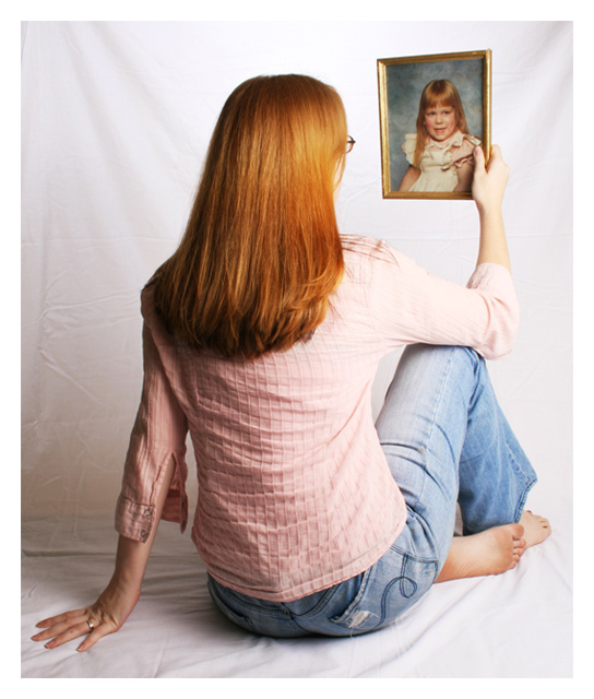
| Very good finish,with an image that tells so much, as mentioned the sheet became a bit distracting, IMO a darker background would have allowed you to retain your highlights, and not show these up on the background,easy said in hind sight. The golden hair is a great highlight. |
|
| Photographer found comment helpful. |
|
|
07/19/2006 08:05:26 PM |
| I think I would have shot this without the sheet. Perhaps in a room that looks like it might have once been a child's room or maybe an empty room. I think it would have had less of a sterile feel. |
|
| Photographer found comment helpful. |
|
|
07/19/2006 12:48:58 AM |
| WOW! ...ok just kidding. :) Actually this is a very nice image and as you said will mean more to you than a stranger. If I was to change anything, I would take the shot from higher and have her looking down (and more relaxed) at the photo, iron the sheets as suggested and maybe soften it (if you can under basic - or forget the challenge and edit for yourself). Overall not a bad finish. :) |
|
| Photographer found comment helpful. |
Comments Made During the Challenge  |
|
|
07/18/2006 11:00:54 AM |
| Very good congratulations... |
|
| Photographer found comment helpful. |
|
|
07/18/2006 05:33:05 AM |
| great shot, the only suggestion I would make is to iron your sheet and keep it tight as the wrinkles I find distracting, * |
|
| Photographer found comment helpful. |
|
|
07/18/2006 02:14:24 AM |
| Right sleeve is a bit washed out, but overall a nice composition. Hair looks nice. |
|
| Photographer found comment helpful. |
|
|
07/17/2006 03:42:40 AM |
| Great idea and composition, but the creases and folds on your backdrop knock a couple of points off for me. |
|
| Photographer found comment helpful. |
|
|
07/16/2006 01:12:06 AM |
What I like about he photo:
Interesting concept... Loved the idea... sweet and pleasent too..
What could be improved:
The angle maybe? Could add on to the overall impact of the photo..
Score
A "5" for me.. :) |
|
| Photographer found comment helpful. |
|
|
07/15/2006 08:58:56 PM |
| Nice interpretation of the challenge - works for me even though the subject's back is to the camera. I'm sure you'll get comments on "iron the sheet" though. |
|
| Photographer found comment helpful. |
|
|
07/15/2006 05:01:53 PM |
| Nailed the theme...bravo! |
|
| Photographer found comment helpful. |
|
|
07/14/2006 09:58:45 AM |
|
| Photographer found comment helpful. |
|
|
07/12/2006 06:45:23 PM |
|
| Photographer found comment helpful. |
|
|
07/12/2006 05:34:46 PM |
| Nice photo where I get the sense of progression, my only suggestion is to use a background that doesn't show the wrinkles, it just looks like a bed sheet. 6 |
|
| Photographer found comment helpful. |
|
|
07/12/2006 12:28:26 AM |
Lovely idea. Like the conceal/reveal technique.
Was the iron broken? The wrinkled backdrop kind of detracts from the appeal of this simple but effective image. |
|
| Photographer found comment helpful. |
Home -
Challenges -
Community -
League -
Photos -
Cameras -
Lenses -
Learn -
Help -
Terms of Use -
Privacy -
Top ^
DPChallenge, and website content and design, Copyright © 2001-2025 Challenging Technologies, LLC.
All digital photo copyrights belong to the photographers and may not be used without permission.
Current Server Time: 03/14/2025 11:59:51 AM EDT.