| Author | Thread |
|
|
07/05/2008 10:15:46 PM |
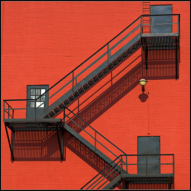
WOW this is so good, the composition, the crop, the color, the shadows, and leading lines.....
Perfect, and it is a shame this wasn't in a challenge, as I think it would have scored high. |
|
 Photographer found comment helpful. Photographer found comment helpful. |
|
|
03/19/2008 10:27:36 PM |
| Great image. Color, composition, exposure, all - right on! |
|
| Photographer found comment helpful. |
|
|
10/12/2006 10:39:52 PM |
| Great striking studies, Batman. This is very good, with the bright colour and sharp shadows. Well done. |
|
| Photographer found comment helpful. |
|
|
09/05/2006 02:52:39 PM |
the colors really pack a punch in this. the stairs, doors, & shadows make it super interesting.
Message edited by author 2006-09-05 14:58:08. |
|
| Photographer found comment helpful. |
|
|
08/11/2006 05:07:57 AM |
|
| Photographer found comment helpful. |
|
|
08/02/2006 09:55:20 AM |
| Lines, angles, and color in spades. |
|
| Photographer found comment helpful. |
|
|
08/02/2006 09:45:26 AM |
|
| Photographer found comment helpful. |
|
|
08/02/2006 12:36:38 AM |
Talk about an attention grabber! Love it.
|
|
| Photographer found comment helpful. |
|
|
08/01/2006 11:33:12 PM |
| Love the color and the shadows. Do not mind the not straight part of the drainpipe. Very strong impact with this one! |
|
| Photographer found comment helpful. |
|
|
08/01/2006 11:21:04 PM |
| the colors and composition are great. may be needs just a bit of straightening. |
|
| Photographer found comment helpful. |
|
|
08/01/2006 11:08:54 PM |
| This one struck me right away of all your new ones. The geometric-ness of this is stunning to say the least. I don't know if it's an illusion, but it looks just a little unhorizontal to me. Would love to see this also in black and white, just cause I like black and white, but I love the color too |
|
| Photographer found comment helpful. |
|
|
08/01/2006 10:58:01 PM |
| Great shadows and colors, good exposure. I would maybe try to crop a bit off the right side to get rid of the drain (??) as it's not straight and is a bit distracting. |
|
| Photographer found comment helpful. |
|
|
08/01/2006 10:57:31 PM |
| Of all your recent batch of shots, I like this one best. In part because I like architecture shots, and in part because of the stark contrast between the red and black. I would rotate it clockwise a hair to try and get things level, but really this is great. I love the shadows too. That little light and the windows on the one door break up the picture just enough to keep it from looking sterile. This is a really nice photo. |
|
| Photographer found comment helpful. |
Home -
Challenges -
Community -
League -
Photos -
Cameras -
Lenses -
Learn -
Help -
Terms of Use -
Privacy -
Top ^
DPChallenge, and website content and design, Copyright © 2001-2025 Challenging Technologies, LLC.
All digital photo copyrights belong to the photographers and may not be used without permission.
Current Server Time: 03/12/2025 01:44:42 AM EDT.