| Author | Thread |
Comments Made During the Challenge  |
|
|
09/18/2003 11:37:00 PM |
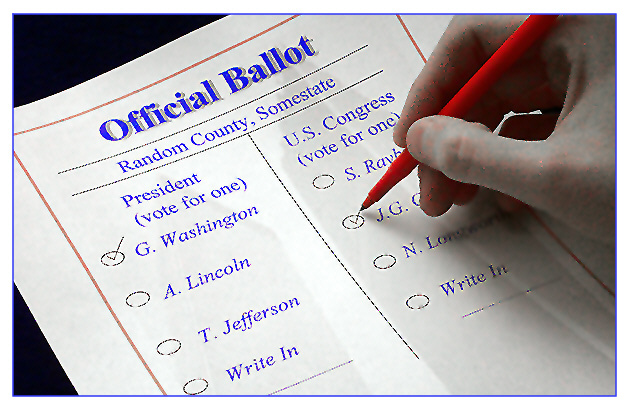
| I'd prefer to vote for some of those candidates too! |
|
 Photographer found comment helpful. Photographer found comment helpful. |
|
|
09/16/2003 09:48:52 AM |
| This photo is overpixelated. I like the idea though. |
|
| Photographer found comment helpful. |
|
|
09/13/2003 10:32:48 PM |
| This is a good one for sure. It's a little eerie, though. Did you mean for the hand to look like a dead person's? |
|
| Photographer found comment helpful. |
|
|
09/13/2003 09:52:13 AM |
| Obviously an impossible ballot, but I like the concept. Color choices are on purpose, I imagine. |
|
| Photographer found comment helpful. |
|
|
09/12/2003 07:58:10 PM |
| This is an excellent idea! Something about this is bugging me though, maybe too much post processing? I also think it might have been better if you could find out who ran against Lincoln or Jefferson (If I remember correctly Washington didn't have any opponents) and use those names instead, maybe use a feathen pen also for more realism. I like the way the hand and pen are placed, I like the way the paper is placed in the frame. Nice job. |
|
| Photographer found comment helpful. |
|
|
09/12/2003 01:32:42 PM |
| What happened to the hand? It looks plastic or something. I think that you had to over tweak something because of an initially bad shot, and that caused the hand to look really bad. |
|
| Photographer found comment helpful. |
|
|
09/12/2003 12:05:18 PM |
| Creative image. The hand looks a bt pixelated, but I really like the idea of the shot. Good luck! |
|
| Photographer found comment helpful. |
|
|
09/12/2003 11:58:46 AM |
| Nice idea! I'm scared of the hand though. 6 |
|
| Photographer found comment helpful. |
|
|
09/12/2003 07:20:46 AM |
| Great idea, shame about the bad artifacting on and around the hand. 6 |
|
| Photographer found comment helpful. |
|
|
09/12/2003 04:40:15 AM |
| Good idea, but... There's a lot visually that's troublesome. There are too many elements - the ballot, the desaturated hand, the twin towers. And a lot of blur and weird edges. It's just ultimately visually jumbled. |
|
| Photographer found comment helpful. |
|
|
09/12/2003 03:51:42 AM |
| bad quality, but nice composition. |
|
| Photographer found comment helpful. |
|
|
09/12/2003 01:07:55 AM |
The black area on the lower left and top left is distracting. Your eyes automatic focus in on these areas. Lot's of noise in the picture. Try turning down the ISO.
It's kind of difficult to see but looks like the World Trade Towers on the paper. Very interesting. |
|
| Photographer found comment helpful. |
|
|
09/12/2003 12:23:11 AM |
| hmmm is that an artifical hand? seems fake anyway and the colors are a bit weird. Nice idea though. |
|
| Photographer found comment helpful. |
Home -
Challenges -
Community -
League -
Photos -
Cameras -
Lenses -
Learn -
Help -
Terms of Use -
Privacy -
Top ^
DPChallenge, and website content and design, Copyright © 2001-2025 Challenging Technologies, LLC.
All digital photo copyrights belong to the photographers and may not be used without permission.
Current Server Time: 04/26/2025 04:32:26 PM EDT.