| Author | Thread |
Comments Made During the Challenge  |
|
|
08/18/2006 06:07:44 PM |
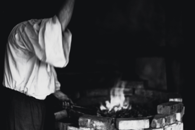
| This is the weirdest shot in the challenge. This headless guy looks like he has a leg growing instead of the right arm (hence no head). :) Strangely, though, this shot captivates me somehow. The same I find Kurosawa movies attractive although the culture in them is so distant. 9 |
|
 Photographer found comment helpful. Photographer found comment helpful. |
|
|
08/18/2006 02:53:19 PM |
| I don't think black and white suits fire well, it is too associated with color, also the focus is a little too soft on this one :( |
|
|
|
08/17/2006 06:28:34 PM |
| B&W was not a good choice for this challenge. The OOF feel also doesnt aid this shot. |
|
|
|
08/17/2006 01:43:18 PM |
| The whites seem a little blown out to me |
|
|
|
08/17/2006 10:49:52 AM |
| Oh my god, it's the headless forger. I actually like the fact that it's out of focus and a little blurry, but where's his head? |
|
|
|
08/15/2006 10:15:22 PM |
| I love the idea of this photo. The greyscale usage is perfect. I just wish it was more in focus. |
|
|
|
08/15/2006 09:03:08 AM |
| he looks like his heads missing. thats very weird. I'd like this sharper too. not all the way to keep that old feel but more than it is. |
|
|
|
08/14/2006 10:53:40 PM |
| OMG where's his head?? Seriously, the crop is too tight and the whole photo is badly out of focus. It would be nice if the forger had a head. Poor guy. |
|
|
|
08/14/2006 10:36:20 PM |
Sure is fire in working for man! Great idea for the challenge. It is OOF and maybe a slightly different angle. But I still say for a fire challenge the fire has to be in color. For these reasons I am giving my base a 5
Wazz |
|
|
|
08/14/2006 07:54:28 PM |
Sadly, with the head not visible and the arm cropped out of the shot, the figure to the left becomes the main focus as the eye is trying to figure out how it makes sense visually. That is what hurts this photo in my opinion.
Another thing that I think would make this better is if there were more of the forge shown (if the photo was cropped / framed looser on the bottom). But that is not a main concern to me. I can also imagine how some might now like the soft focus - but I do in fact like it. I think it gives the feel of a dated postcard or photograph, which the monochrome helps to achieve. Overall I think this is an image that has a lot of potential but does not really live up to it. If you have the chance to go back and retake or recrop the shot, I would love to see how it would be with some improvements worked in. |
|
| Photographer found comment helpful. |
|
|
08/14/2006 07:18:47 PM |
|
|
|
08/14/2006 06:05:46 PM |
| I would have rather seen this one in color. It also seems a little blurry IMO. |
|
|
|
08/14/2006 03:48:15 PM |
| If it were a sharper photo it would be better. The black and white work well for the photo though. |
|
|
|
08/14/2006 03:58:27 AM |
| Sorry, but that's really out of focus. Nice idea though. I just can't help but think... Ichabod Crane's Headless Horseman's day job. |
|
|
|
08/14/2006 03:57:21 AM |
| I like the conversion but would like to have seen a little more of the image in focus (MHO) |
|
|
|
08/14/2006 12:43:25 AM |
| a blurry out of focus picture is what I see here...sorry :-( |
|
Home -
Challenges -
Community -
League -
Photos -
Cameras -
Lenses -
Learn -
Help -
Terms of Use -
Privacy -
Top ^
DPChallenge, and website content and design, Copyright © 2001-2025 Challenging Technologies, LLC.
All digital photo copyrights belong to the photographers and may not be used without permission.
Current Server Time: 03/14/2025 09:28:21 AM EDT.