| Author | Thread |
Comments Made During the Challenge  |
|
|
08/18/2006 01:28:33 AM |
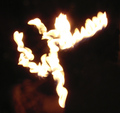
| A sharper focus may have helped, but more than that I think there's a problem with how the flame sort of becomes the background. At least for me, there's not enough of a distinction there. But I do like the composition and concept. |
|
 Photographer found comment helpful. Photographer found comment helpful. |
|
|
08/17/2006 08:19:14 PM |
| Too close for my liking as the "5" on the bill catches my eye more than the flame |
|
| Photographer found comment helpful. |
|
|
08/17/2006 02:03:45 PM |
| If you have that much, send some my way |
|
|
|
08/15/2006 07:28:50 AM |
| this needs a lot more contrast , nice idea though. |
|
| Photographer found comment helpful. |
|
|
08/14/2006 10:39:18 PM |
| Too bright, very noisy. I am hoping this is a fake bill, lest you upset some people who don't have $5 bills to waste. |
|
| Photographer found comment helpful. |
|
|
08/14/2006 07:49:17 PM |
The first thing is it feel real abstract until I see the 5. It is not really in focus and I dont get the feel of fire as I have see from others in this challenge. 5
Wazz |
|
| Photographer found comment helpful. |
|
|
08/14/2006 11:54:53 AM |
| good concept, looks more like an orange glow than flames |
|
| Photographer found comment helpful. |
|
|
08/14/2006 10:45:21 AM |
| I'd like to see the burnt edges of the money ... |
|
| Photographer found comment helpful. |
|
|
08/14/2006 08:14:38 AM |
| just too blurry and grainy imho |
|
| Photographer found comment helpful. |
Home -
Challenges -
Community -
League -
Photos -
Cameras -
Lenses -
Learn -
Help -
Terms of Use -
Privacy -
Top ^
DPChallenge, and website content and design, Copyright © 2001-2025 Challenging Technologies, LLC.
All digital photo copyrights belong to the photographers and may not be used without permission.
Current Server Time: 03/14/2025 09:28:14 AM EDT.