| Author | Thread |
|
|
08/11/2002 02:45:00 PM |
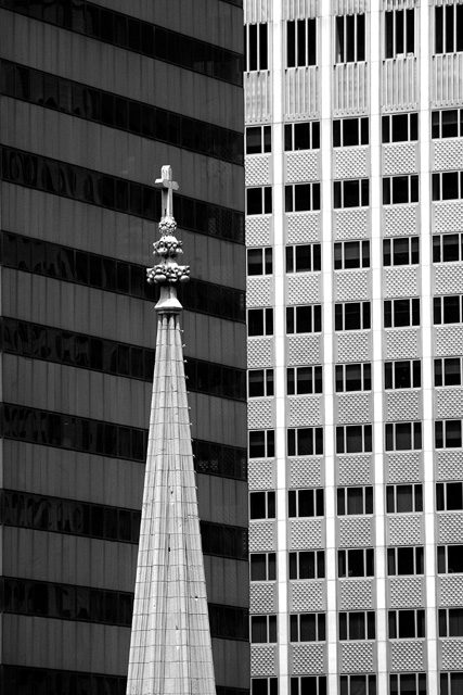
| Very happy to see that the view from my office window could land me a 2nd place this week!!! Actually, I have to walk a few cubicles away to get the right angle. It was shot pretty much "at level" from the 22nd floor of tower 49 in Midtown Manhattan. In terms of composition the choices are pretty much limited to using the 2 St-Patricks towers and 3 buildings in the background vs. 1/2 like I did here. Shot with a 190 mm zoom (300mm effective) zoom at 5.6 f-stop with 350th speed to avoid blur (typically even better at 500th) - ISO 200. Black and white was much more effective as it enhances the contrast of the church. Thanks for all the comments and feedback + votes!! |
|
|
|
08/05/2002 08:51:00 AM |
| Congratulations on seccond place--great picture!! |
|
Comments Made During the Challenge  |
|
|
08/04/2002 09:26:00 PM |
| i love this photo. it's simple but tells a lot. very effective. |
|
|
|
08/04/2002 08:43:00 PM |
| I'm not sure that B&W works well for this photo, but I do like the theme. |
|
|
|
08/03/2002 01:03:00 PM |
| I like the bw and the strong vertical lines of this. The steeple really provides a contrast with that, in more ways than one. karmat |
|
|
|
08/03/2002 11:29:00 AM |
|
|
|
08/02/2002 05:28:00 PM |
Which one?? :)
I liked it. |
|
|
|
08/02/2002 08:19:00 AM |
| good eye for 2 good contrasts. well shot. |
|
|
|
08/02/2002 06:50:00 AM |
|
|
|
08/01/2002 10:29:00 PM |
| wow. graphically incredible.id like church top to go higher in the frame so it doesnt seem quite so small in comparison to the sky scrapers but that may have been a cropping limitation. mag99 |
|
|
|
08/01/2002 12:34:00 PM |
| Excellent composition! One of my favorites this week....I'd like to see this photo in color if you decide to post after the competition. (Just curious what color is added by these buildings.) |
|
|
|
07/31/2002 08:39:00 PM |
| The name is wrong but this is the best photo in the group. Best captures the theme. |
|
|
|
07/31/2002 06:23:00 PM |
| Great composition. In my top three this week! |
|
|
|
07/31/2002 04:12:00 PM |
| Nice contrast, in more ways then one... |
|
|
|
07/31/2002 07:55:00 AM |
| A marvelous use of black & white. Just love this shot. |
|
|
|
07/31/2002 06:56:00 AM |
|
|
|
07/31/2002 02:03:00 AM |
| Being an atheist, I have trouble deciphering which is which in this photo. (I could swear I've seen a similar shot somewhere before.) |
|
|
|
07/30/2002 09:24:00 PM |
| I like the simplicity of this! Were you able to try different angles to get the buildings and church on different lines? |
|
|
|
07/30/2002 06:37:00 PM |
|
|
|
07/30/2002 05:14:00 PM |
| Great composition and use of B&W. |
|
|
|
07/30/2002 12:46:00 PM |
| i like this, but then again, i wouldn't say the church is "heaven" when there are priests around :) |
|
|
|
07/30/2002 07:44:00 AM |
| I love this one - great concept and execution. I love contrasts and this one is very well done. Beautifully un-cluttered and simple. Exposure is bang on. Focus is good. I just cant quite decide if this is best left in B&W or if some kind of colour contrast would help things. Perhaps have the steeple in colour and the rest B&W? Outside the scope of this competition, though. |
|
|
|
07/30/2002 01:30:00 AM |
| 10!!!!!!!!!!!!!!!!!!!!!!!!!!!!!!!!!!!!!!!!!!!!!!!!!!!!!!!!!!!!!!!!!!!!!!!!!!!!!!!!!!!!!!!!!!!!!!!!!! |
|
|
|
07/29/2002 11:16:00 PM |
| Can I have my breath back when your done with it? This shot took it away... Solid 10 |
|
|
|
07/29/2002 11:06:00 PM |
| this has a dizzying effect..the compression of the background is immense...great shot I like it-8 |
|
|
|
07/29/2002 09:17:00 PM |
| Nice clean shot with good subject matter for the challenge! I like the angles and contrasts! Very well done |
|
|
|
07/29/2002 07:55:00 PM |
| Great idea well executed. |
|
|
|
07/29/2002 05:09:00 PM |
| wow... this image speaks many volumes to me... first of all, i love the contrasts. The black and white was an excellent choice for this photo. I won't go into my theological relevance of this photo, but I can tell you that it works well for me :) Croporations swallow a lot of things, including faith, religion, and churches :) = great shot.. one of my favorites this week :) - jmsetzler |
|
|
|
07/29/2002 04:59:00 PM |
| great use of line and greyscale |
|
|
|
07/29/2002 02:11:00 PM |
| Great combination! Great composition! Simple and very effective.Love it. |
|
|
|
07/29/2002 09:36:00 AM |
| Nice shot, great framing to contrast and bring out the steeple. Only suggestion would be to frame it down a little bit. |
|
|
|
07/29/2002 09:36:00 AM |
|
|
|
07/29/2002 04:40:00 AM |
Even though the dark building is in front of the light one, the light one seems to
"come forward" and it creates an unpleasant sensation. |
|
|
|
07/29/2002 04:19:00 AM |
| The symmatry in this image is breathtaking. |
|
|
|
07/29/2002 02:10:00 AM |
| I love this is b/w. Nicely done:) |
|
|
|
07/29/2002 01:22:00 AM |
beautiful. i love how you have used black and white to accentuate the lines, and the contrast is a great idea as well.
|
|
|
|
07/29/2002 01:05:00 AM |
| the only 10 i gave this week - i wanted to do a church shot, but i didn't have the balls |
|
Home -
Challenges -
Community -
League -
Photos -
Cameras -
Lenses -
Learn -
Help -
Terms of Use -
Privacy -
Top ^
DPChallenge, and website content and design, Copyright © 2001-2025 Challenging Technologies, LLC.
All digital photo copyrights belong to the photographers and may not be used without permission.
Current Server Time: 04/27/2025 12:11:05 AM EDT.


 Heaven and Hell


