| Author | Thread |
|
|
08/24/2006 10:25:37 AM |
| Great top 20 finish. Inventive~ |
|
 Photographer found comment helpful. Photographer found comment helpful. |
|
|
08/24/2006 01:18:48 AM |
| Cute concept to frame the beauty. Congratulations on your top 20 finish. |
|
| Photographer found comment helpful. |
|
|
08/23/2006 04:31:23 AM |
| Sheez.....aren't you lucky that Leroy wasn't available. I beat you in this challenge...hahahahaha!! But congrats on a high score. |
|
| Photographer found comment helpful. |
Comments Made During the Challenge  |
|
|
08/22/2006 09:30:19 PM |
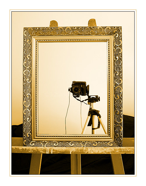
| The colors and composition are very nice here. Love thelines from the frame and even the tripod. A shame about the flash and remote cords and the camera strap. They break the simple and sharp lines of the shot. I think I may have tied them up to have them hidden. Nic ework overall. |
|
| Photographer found comment helpful. |
|
|
08/22/2006 07:09:09 AM |
| love the gold tones, but the camera is a little small in the shot for my liking. good job. |
|
| Photographer found comment helpful. |
|
|
08/22/2006 03:54:53 AM |
|
| Photographer found comment helpful. |
|
|
08/21/2006 09:10:22 PM |
| This will do quite well. Great tones. |
|
| Photographer found comment helpful. |
|
|
08/21/2006 09:06:20 AM |
| I looked at this a second time, and have now commented on it as well, as it is a very good idea, and well taken, so I have now bumped it up as well..... |
|
| Photographer found comment helpful. |
|
|
08/21/2006 08:50:30 AM |
| i gave this an eight. generally, there is a lot to like and appreciate with this picture. the ornateness of the frame is super, the use of an easel fits, and the plain background (both behind and in the mirror) work well. I especially like how you're utilising the mirror as a key subject of the picture and composition. i do like where the camera is in terms of positioning in the mirror, but i am not too keen on how the camera is tilted on to it's side; just doesn't feel right in terms of being a natural, erm, pose. also the colours (a sort of yellowy pink) the tint the whole image kind of detracts from it's naturalness. still, i think it deserves a solid eight. |
|
| Photographer found comment helpful. |
|
|
08/20/2006 02:09:52 PM |
| Very, very nice. Love the golden tones. I think your border might be too overpowering but I won't hold that against you. This is one of my favourites. |
|
| Photographer found comment helpful. |
|
|
08/20/2006 01:06:54 PM |
|
| Photographer found comment helpful. |
|
|
08/20/2006 09:49:37 AM |
| A very nice portrait indeed - nice choice of setting, good lighting. |
|
| Photographer found comment helpful. |
|
|
08/19/2006 05:06:56 PM |
| Framing is a bit distracting 5 |
|
|
|
08/18/2006 07:29:45 PM |
| This picture is in the top of this challenege, at least in my mind. My only wish is that I could see the whole easel on the side and I would nix the black fabric. |
|
| Photographer found comment helpful. |
|
|
08/17/2006 08:05:21 PM |
|
|
|
08/17/2006 01:08:18 PM |
| Personally I'd do away with the over-powering border. You image is very nicely done (composition/lighting). It might lack some "wow" factor to grab higher points from the tough voters. |
|
| Photographer found comment helpful. |
|
|
08/17/2006 10:49:23 AM |
| Very artistic...love the colors and composition. One of the top. |
|
| Photographer found comment helpful. |
|
|
08/17/2006 05:40:26 AM |
a good composition works
tastefully done
ppeople going to like it
so do i |
|
| Photographer found comment helpful. |
|
|
08/16/2006 11:55:02 PM |
| would have been better without the cables |
|
| Photographer found comment helpful. |
|
|
08/16/2006 02:16:40 PM |
| nice job on the composition |
|
| Photographer found comment helpful. |
|
|
08/16/2006 11:15:30 AM |
| I really like this one! So creative, and executed to perfection! Think this one well-deserves a 10 :) |
|
| Photographer found comment helpful. |
|
|
08/16/2006 10:15:22 AM |
| I'd like to see this life size! The pixel limitations are working against you here, making the camera too small. It should be closer to the mirror. You are also wasting pixels with that large border. One frame is really enough. |
|
|
|
08/16/2006 07:52:49 AM |
| Now this is nicelly done! crisp, clean and well focused |
|
| Photographer found comment helpful. |
|
|
08/16/2006 03:13:58 AM |
| very good...I like the result...perhaps the white border is a little thick??? |
|
| Photographer found comment helpful. |
Home -
Challenges -
Community -
League -
Photos -
Cameras -
Lenses -
Learn -
Help -
Terms of Use -
Privacy -
Top ^
DPChallenge, and website content and design, Copyright © 2001-2025 Challenging Technologies, LLC.
All digital photo copyrights belong to the photographers and may not be used without permission.
Current Server Time: 03/12/2025 07:39:18 AM EDT.