| Author | Thread |
Comments Made During the Challenge  |
|
|
08/04/2002 10:37:00 PM |
Composition - quite good
Technical Aspects - quite good
Meets Challenge - yes
Visual Impact / Originality - quite good
|
|
 Photographer found comment helpful. Photographer found comment helpful. |
|
|
08/04/2002 08:42:00 PM |
| Seems to be a bit blurry and noisy, but good overall theme. |
|
| Photographer found comment helpful. |
|
|
08/04/2002 04:26:00 PM |
| Nice composition and crisply shot, not sure about how well it relates to the theme. |
|
|
|
08/01/2002 10:44:00 PM |
| i really like the composition but i find the background color really doesn't go with the other colors. something more simple would probably have enhanced the picture greatly. mag99 |
|
| Photographer found comment helpful. |
|
|
08/01/2002 05:52:00 AM |
| Don't understand your title or your intention. 3 sjgleah |
|
|
|
07/31/2002 06:43:00 AM |
|
|
|
07/30/2002 06:42:00 PM |
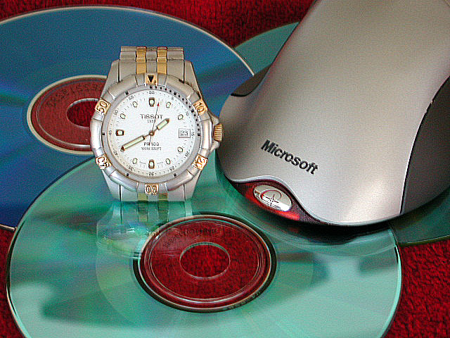
| Title? I think it resembles your photo, a bit jumbled. I would call this a little bit of a reach for this challenge. The photo is well taken. The focus is pretty good (the watch face seems "off" just a bit. Framing is too much of a personal choice to me, I prefer to not cut off subjects, but this is acceptable. I like the reflection of the watch in the CD. I'm not crazy about the carpet, but you make due with what you have on hand. As a just plain photo, it's about a 7, as a challenge photo, about the best I can go is 5. Swash |
|
| Photographer found comment helpful. |
|
|
07/30/2002 10:48:00 AM |
| Hmmm � great picture, well lit and fits the challenge. I would say it's a bit too clinical, but then, so is capitalism� (8) |
|
|
|
07/30/2002 08:33:00 AM |
| A bit too literal for my tastes. Also the focus seems a bit off. The lighting is ok but not very dramatic. Those CDs could be giving us more colour. |
|
| Photographer found comment helpful. |
|
|
07/29/2002 08:41:00 PM |
| The only thing detracting from this pix is the out of focus watch face. |
|
| Photographer found comment helpful. |
|
|
07/29/2002 05:21:00 PM |
| good design and use of colors |
|
|
|
07/29/2002 02:14:00 PM |
|
|
|
07/29/2002 02:12:00 PM |
| I like the colors in this, and the idea is good. I think, however, you almost have two separate pictures going on. I would have preferred it without the watch. karmat |
|
| Photographer found comment helpful. |
|
|
07/29/2002 04:41:00 AM |
7:-
It is a well set up photograph that shows the topic matter in a fairly good way. I think however that the photo it a bit blurred, where the camera has been moved or something, and it has tried to be sharpened in photoshop, although that adds a horrible grain to the photo. |
|
| Photographer found comment helpful. |
|
|
07/29/2002 02:29:00 AM |
| Good picture if it were in focus |
|
Home -
Challenges -
Community -
League -
Photos -
Cameras -
Lenses -
Learn -
Help -
Terms of Use -
Privacy -
Top ^
DPChallenge, and website content and design, Copyright © 2001-2025 Challenging Technologies, LLC.
All digital photo copyrights belong to the photographers and may not be used without permission.
Current Server Time: 04/27/2025 08:55:17 AM EDT.