| Author | Thread |
Comments Made During the Challenge  |
|
|
08/04/2002 10:01:00 PM |
Composition - good
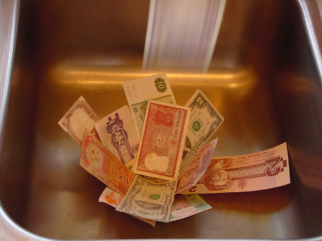
Technical Aspects - good. But what is the reflection in back?
Meets Challenge - yes
Visual Impact / Originality - good
|
|
 Photographer found comment helpful. Photographer found comment helpful. |
|
|
08/02/2002 04:38:00 PM |
| A tighter crop to fix the lower left and maybe some white balancing (it has an orange cast to me) would have helped this picture I think. karmat |
|
| Photographer found comment helpful. |
|
|
08/02/2002 07:58:00 AM |
| love that motion blur you got! mag99 |
|
| Photographer found comment helpful. |
|
|
08/01/2002 02:23:00 PM |
| I like the idea of showing motion in your picture using the bill at top but I would have preferred it, if the bill was clearer. Could you have moved the bill at a slower pace? |
|
| Photographer found comment helpful. |
|
|
07/31/2002 09:38:00 PM |
| lol, very nice. I think a toilet would have worked well too. The color balance seems overly warm to me |
|
| Photographer found comment helpful. |
|
|
07/31/2002 01:56:00 PM |
|
|
|
07/31/2002 05:34:00 AM |
| I cannot fault the quality of picture itself, but the composition seems to be a little dull. It's only a personal opinion and I can't even say why � sorry� |
|
|
|
07/31/2002 01:54:00 AM |
| If I see another "down the drain" photo, I'll scream! |
|
|
|
07/30/2002 09:35:00 PM |
| nicely done! Only one thing I would change... get rid of the $5 US bill, and that would make the $2 US bill stand out against the canadian bills. It would really make an interesting statement!!! Well done -8 |
|
| Photographer found comment helpful. |
|
|
07/30/2002 07:41:00 AM |
| Quite a few people used this same concept this week. Yours is one of the better examples of it. But the lighting is still not right. You need to decide where you want the viewers eye to go and make sure the lighting supports that. Overall your shot is too dark. Also not enough of the sink is visible for the viewer to know what's going on. |
|
| Photographer found comment helpful. |
|
|
07/30/2002 01:34:00 AM |
| perhaps more than 1 bill floating would have given a cooler effect.... |
|
| Photographer found comment helpful. |
|
|
07/29/2002 10:04:00 PM |
| you need a closer crop to cut out the distracting edges..BTW is that blurred bill going up or down...nice idea |
|
| Photographer found comment helpful. |
|
|
07/29/2002 08:37:00 AM |
| Nice concept. Good focus. Lighting is good. Is the white smear on the top from your flash? It takes away a bit from the picture. |
|
| Photographer found comment helpful. |
Home -
Challenges -
Community -
League -
Photos -
Cameras -
Lenses -
Learn -
Help -
Terms of Use -
Privacy -
Top ^
DPChallenge, and website content and design, Copyright © 2001-2025 Challenging Technologies, LLC.
All digital photo copyrights belong to the photographers and may not be used without permission.
Current Server Time: 03/12/2025 07:50:11 PM EDT.