| Author | Thread |
Comments Made During the Challenge  |
|
|
08/01/2002 10:31:00 PM |
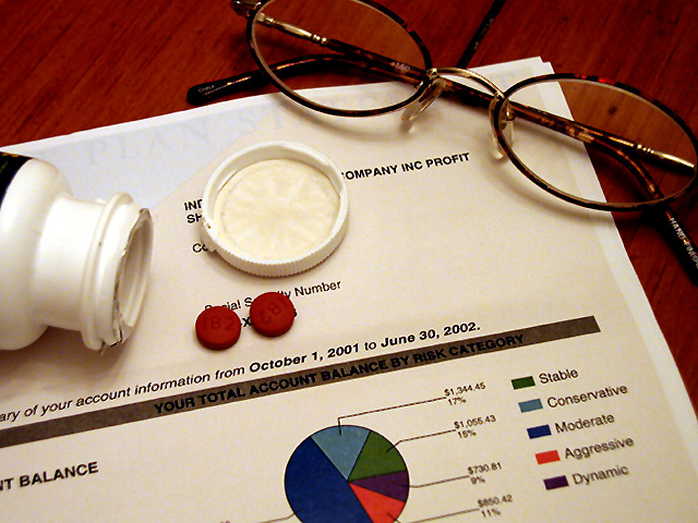
| I feel bad for the person in this watching their stock price go down and having to take aspirin. Good job of conveying that emotion. Nice colors in the shot. Good framing. mag99 |
|
|
|
08/01/2002 05:14:00 PM |
| Nice framing and color, but I'd like to see a little more dramatic lighting. |
|
|
|
07/31/2002 09:07:00 PM |
| Nice, tightly cropped, clear, and I'm sure many can relate to it. Met the challenge. |
|
|
|
07/30/2002 11:37:00 PM |
Composition - very good
Technical Aspects - very good
Meets Challenge - yes
Visual Impact / Originality - good
|
|
|
|
07/30/2002 10:15:00 PM |
| Having seen the performance of my own financial plans -- or lack thereof -- I can relate to this photo. This would make a good illustration for a magazine article on such plans. |
|
|
|
07/30/2002 07:30:00 PM |
| This is reall nice. I know why you placed the pills and lid where you did, and these props are GREAT (I was leading up to suggesting you photograph your account sheet, edit it and re-print it, but wow, that's alot of work for a small chance at an electronic blue ribbon, forget that!) This is very well done and I am going to raise your score from 8 to 9, just to prove it. (what no 10?) Swash |
|
|
|
07/30/2002 06:58:00 PM |
| Objects could look more accidentally placed, I think |
|
|
|
07/30/2002 12:39:00 PM |
| Good idea, but the limited depth of focus doesn't work well for this image (see the bottle). I'd only use that trick when you want to draw attention to near vs. far objects. Here it's distracting. |
|
|
|
07/29/2002 11:46:00 PM |
| Photo seems very staged. I realize that the pills and the cap are place to cover certain items, but the glasses seem awkwardly placed. I think I would like it better if the glasses were unfolded and "thrown haphazardly" to emphasize the frustration. |
|
|
|
07/29/2002 02:27:00 PM |
I think this is a good foundation (nice composition and props). It would have been nice if your numbers indicated a huge loss in the market. Also, I think the levels could have been played with here to make it more 'headache-like.' Maybe b&w 6
On second look bumping to a 7...it's growing on me! |
|
|
|
07/29/2002 01:49:00 PM |
| works pretty well. I didin't like my 401k statement either. |
|
|
|
07/29/2002 10:27:00 AM |
| good composition and the glasses without glare great |
|
|
|
07/29/2002 07:34:00 AM |
| Very nice composition. Falling charts would have maybe caused more headache. |
|
|
|
07/29/2002 02:04:00 AM |
| Better take three cause it's gonna get worse. Nicely done ! |
|
Home -
Challenges -
Community -
League -
Photos -
Cameras -
Lenses -
Learn -
Help -
Terms of Use -
Privacy -
Top ^
DPChallenge, and website content and design, Copyright © 2001-2026 Challenging Technologies, LLC.
All digital photo copyrights belong to the photographers and may not be used without permission.
Current Server Time: 03/31/2026 02:55:40 AM EDT.