| Author | Thread |
Comments Made During the Challenge  |
|
|
08/04/2002 11:12:00 PM |
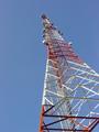
| Your colors are pretty dark and drab -- brighten up the picture by adjusting your levels! I'm also not sure what purpose the traffic light plays in your picture. |
|
|
|
08/04/2002 10:19:00 PM |
Composition - OK
Technical Aspects - good
Meets Challenge - yes
Visual Impact / Originality - ok
|
|
|
|
08/03/2002 11:51:00 PM |
| Was there a way to have stepped around or ducked under this sign post? Maybe there is a meaning behind it for you, but I don't think it adds to the photo. |
|
|
|
07/30/2002 09:20:00 PM |
|
|
|
07/30/2002 11:30:00 AM |
| A pretty average shot of a building, ruined by traffic lights intruding into the frame. You need to find and angle where they dont intrude, or an angle where they become a proper part of the picture, maybe via a long exposure at dusk, or underlining the carved words. |
|
|
|
07/30/2002 12:36:00 AM |
| A different vantage might have yielded a nicer photo - the stoplights and the crosswalk lights are distracting. I'm sure the upper floors of the building must have some interest - a portrait orientation photo might work better. |
|
|
|
07/29/2002 02:18:00 PM |
| I think framing differently to get the lights and stuff out would have put more emphasis on the bank. karmat |
|
|
|
07/29/2002 08:20:00 AM |
| Good subject but I think you could have done more with it. |
|
|
|
07/29/2002 07:26:00 AM |
| Ok, nice picture, but is the clue? |
|
|
|
07/29/2002 05:14:00 AM |
| I lack the technical expertise to suggest what might improve this image; I just know that I find it somewhat uninteresting. The traffic lights definitely mar the overall look for me. |
|
Home -
Challenges -
Community -
League -
Photos -
Cameras -
Lenses -
Learn -
Help -
Terms of Use -
Privacy -
Top ^
DPChallenge, and website content and design, Copyright © 2001-2025 Challenging Technologies, LLC.
All digital photo copyrights belong to the photographers and may not be used without permission.
Current Server Time: 03/12/2025 07:16:25 PM EDT.