| Author | Thread |
|
|
09/08/2006 03:31:14 AM |
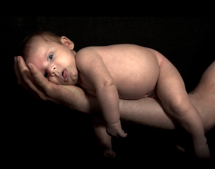
Should have positioned his stomach more flat against dad's arm because that position gives him a pot belly. Also, correct me if I'm wrong, but is the baby a bit... "over exposed"? Something you gotta watch for...
And as has been said, the facial expression needs improvement.
Seems you took a lot of criticism. I suppose that is to be expected when you do a post that has been done because a lot of people have physically done this pose (I have) and so there is much more criticism. |
|
 Photographer found comment helpful. Photographer found comment helpful. |
Comments Made During the Challenge  |
|
|
09/07/2006 10:48:16 PM |
| a bit over processed. Would have been better for me in sepia tones. |
|
| Photographer found comment helpful. |
|
|
09/07/2006 10:05:12 PM |
| Awww - I think I know who this is and I'm so touched by tribute... :) I see you've done it with some fine justice! I really appreciate the lighting on the baby's face. You've done well here - it's so tough to get the baby balanced and not squirming and you've really just nailed it. Good luck in the challenge, sweets! |
|
| Photographer found comment helpful. |
|
|
09/07/2006 09:53:20 PM |
| wish the background was a smooth black |
|
| Photographer found comment helpful. |
|
|
09/07/2006 08:31:04 PM |
| Funny look on his face, but overall this image doesn't do it for me. The bright spot on the cheek for one, he isn't laying flat which I think might add appeal... Not sure, just doesn't grab me. |
|
| Photographer found comment helpful. |
|
|
09/05/2006 05:42:34 PM |
| I like the image concept, just the distortion on the babes face is spoiling this for me. |
|
| Photographer found comment helpful. |
|
|
09/05/2006 08:10:19 AM |
|
| Photographer found comment helpful. |
|
|
09/03/2006 03:07:16 PM |
| I would like the photo much better if the baby was sleeping. I realize that newborns are hard to photograph, but this facial expression leaves a little to be desired. ALso your light might have been better moved around the other side of the subject. You never want to light up at a subjects nose. Even if they are laying down. Your catch light should almost always be seen in the top part of the eye. If you see it in the bottom part then you know you light could be better. Just a thought. |
|
| Photographer found comment helpful. |
|
|
09/02/2006 04:38:07 PM |
| poor kid doesnt look too comfortable so that takes away from this a little. great lighting and focus though.7 |
|
| Photographer found comment helpful. |
|
|
09/02/2006 04:20:53 PM |
|
| Photographer found comment helpful. |
|
|
09/02/2006 08:36:44 AM |
| kind of macabre, looks dead to me :), not sure maybe o would have aimed T THE FACE WHICH SEEMS.(oops) which seems to be the main focus here, just my 2 cents |
|
| Photographer found comment helpful. |
|
|
09/02/2006 01:35:22 AM |
|
| Photographer found comment helpful. |
|
|
09/01/2006 10:02:14 PM |
| His face is smooshed and just doesn't look comfortable. It looks underexposed. |
|
| Photographer found comment helpful. |
|
|
09/01/2006 02:49:46 PM |
| Like the concept but what's up with the look on the baby's face? It looks like it's in shock! ha You could have benefitted with some better light also. |
|
| Photographer found comment helpful. |
|
|
09/01/2006 11:10:53 AM |
| i really am not a fan of this one, the babys belly seems blown-up, and the expression is weird.. but trust me i do know how hard it is to photograph infants!! |
|
| Photographer found comment helpful. |
|
|
09/01/2006 05:28:58 AM |
That expression is too much !!!
Love this shot. |
|
| Photographer found comment helpful. |
|
|
09/01/2006 05:28:37 AM |
|
| Photographer found comment helpful. |
|
|
09/01/2006 12:50:39 AM |
| awwww how proud you must be! gl 8 |
|
| Photographer found comment helpful. |
Home -
Challenges -
Community -
League -
Photos -
Cameras -
Lenses -
Learn -
Help -
Terms of Use -
Privacy -
Top ^
DPChallenge, and website content and design, Copyright © 2001-2025 Challenging Technologies, LLC.
All digital photo copyrights belong to the photographers and may not be used without permission.
Current Server Time: 03/12/2025 08:06:58 AM EDT.