| Author | Thread |
|
|
09/13/2006 09:36:16 PM |
hello from the critique club
my name is christian, and i'm a memeber of the CC. if you have any questions about this critique, please pm me and i'll try to help with anything i can.
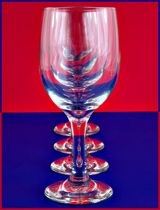
a very interesting image. techincally very good, with the receedihng lines of the glasses drawing you in. the texture and detail of the glass itself are well rendered too.
however, i find the colour on the background becomes overpowering and distracting. i think it may be the flatness and purity of the tone that works agains the image. with perhaps a bit more variation of tone in the background, it would bring the eye in to the glasses more, focus our attention. i also find the border very distracting to your image. it sets up an unpleasant dissonance, and actively draws the eye from your subject. lastly, i think the glasses could be improved by a little darker tones on some of the reflections. the midtones do tend to blur together.
so, a very nice image that, with a little work, could be outstanding. well done indeed.
if you have any qyestions about this crit, please pm me.
best wishes,
c. |
|
Comments Made During the Challenge  |
|
|
09/07/2006 08:47:24 PM |
|
|
|
09/07/2006 05:14:37 PM |
| Cool. Most original of my first 90 i've seen. Only detracting feature is the light/glare reflection of the glasses. Otherwise well done. 8 |
|
|
|
09/07/2006 02:41:10 PM |
|
|
|
09/07/2006 06:11:21 AM |
| very strange effect, but lovely 8 |
|
|
|
09/07/2006 03:30:02 AM |
Wowsers! Quite the vivid presentation here. Almost, but not quite too much:-)
I actually like it. Very eyecatching. A nice take...and execution of a classic theme. Nice job. |
|
|
|
09/05/2006 11:05:33 PM |
| love what you have done here...the coloring in the bottom of the glasses is awesome! 10 |
|
|
|
09/04/2006 05:04:24 PM |
|
|
|
09/03/2006 05:17:17 PM |
|
|
|
09/03/2006 11:53:18 AM |
|
|
|
09/02/2006 09:36:15 PM |
| i dont feel these colors work well together but i like the concept and crop. |
|
|
|
09/02/2006 02:05:59 PM |
| There is too much reflection on the tops of the glasses |
|
|
|
09/02/2006 01:16:23 PM |
| I love the frame! (this is coming from a frame hater unless it's all black or white, too :-) Technically, this seems pretty much perfect. I have to try this sometime. |
|
|
|
09/02/2006 05:24:04 AM |
| Yes, I like this. Well executed. |
|
|
|
09/02/2006 12:58:45 AM |
| Excellent setup and execution, but I'm not too fussed about the chosen colours and border effect. |
|
|
|
09/01/2006 09:02:19 PM |
| Great photo. I did this once for a photo class. The only difference is I didn't use any color as my background. Wonderful and creative idea. |
|
|
|
09/01/2006 03:45:58 PM |
| nice shot! The border is wild looking going from blue to red. 9 |
|
|
|
09/01/2006 06:12:27 AM |
| Love the idea of this one - simple but very effective |
|
Home -
Challenges -
Community -
League -
Photos -
Cameras -
Lenses -
Learn -
Help -
Terms of Use -
Privacy -
Top ^
DPChallenge, and website content and design, Copyright © 2001-2025 Challenging Technologies, LLC.
All digital photo copyrights belong to the photographers and may not be used without permission.
Current Server Time: 03/12/2025 02:21:02 PM EDT.