| Author | Thread |
|
|
09/11/2006 11:42:49 PM |
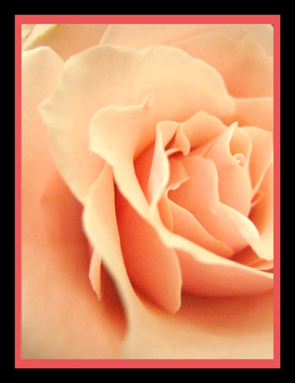
I like the color of the flower and the slightly different crop.
Two things really stand out for me that could be improved - the border and the noise in the dark areas. I agree with the comments below about the border and have nothing to add, except that a different color on the inner border may work better if you still wanted it. The noise in the dark areas is quite a bit and probably could have been removed during editing. The rose is nice and soft, but makes me wonder if it's soft on purpose or a bit out of focus. I would have cloned out the little dot in upper right corner. |
|
 Photographer found comment helpful. Photographer found comment helpful. |
|
|
09/11/2006 08:04:46 AM |
| OK... so I made a mistake with the border... I will NEVER do that again!!!! |
|
Comments Made During the Challenge  |
|
|
09/10/2006 03:46:14 PM |
|
| Photographer found comment helpful. |
|
|
09/10/2006 02:01:33 PM |
| This is lovely, but I think would do better without the border. |
|
| Photographer found comment helpful. |
|
|
09/10/2006 10:33:28 AM |
| This should do very well. Beautiful pastel shade. Can't make up my mind whether I like the border or not. |
|
| Photographer found comment helpful. |
|
|
09/10/2006 01:28:46 AM |
| I'n not a fan of such overpowering borders, but ignoring that for the vote, as it's just my opinion, - a 7 |
|
| Photographer found comment helpful. |
|
|
09/10/2006 12:42:37 AM |
| Your border really overpowers the photograph. With that said your subject is very nice and soft. |
|
| Photographer found comment helpful. |
|
|
09/09/2006 08:41:33 PM |
| this border really detracts from the softness of the rose, which needs to be a little sharper in the center petals |
|
| Photographer found comment helpful. |
|
|
09/06/2006 09:43:44 PM |
| I don't like the border - I think it detracts from the photo |
|
| Photographer found comment helpful. |
|
|
09/04/2006 03:33:59 PM |
| The pink border is distracting from the nice color of the rose |
|
| Photographer found comment helpful. |
|
|
09/04/2006 02:31:13 PM |
| The softness of this image and the stunning pastel hues are overpowered by the harshness of the frame. I do find this image very appealing and the high vote it garners will not be offset by the frame. I can only hope that others will vote in the same vein. |
|
| Photographer found comment helpful. |
|
|
09/04/2006 10:37:47 AM |
| I like the border, a bit grainy |
|
| Photographer found comment helpful. |
|
|
09/04/2006 06:15:33 AM |
| The boarder is doing more than the image, |
|
| Photographer found comment helpful. |
|
|
09/04/2006 04:37:50 AM |
|
| Photographer found comment helpful. |
|
|
09/04/2006 02:25:05 AM |
|
| Photographer found comment helpful. |
Home -
Challenges -
Community -
League -
Photos -
Cameras -
Lenses -
Learn -
Help -
Terms of Use -
Privacy -
Top ^
DPChallenge, and website content and design, Copyright © 2001-2025 Challenging Technologies, LLC.
All digital photo copyrights belong to the photographers and may not be used without permission.
Current Server Time: 03/14/2025 07:42:04 PM EDT.