| Author | Thread |
Comments Made During the Challenge  |
|
|
08/04/2002 10:16:00 PM |
Composition - good
Technical Aspects - good
Meets Challenge - yes
Visual Impact / Originality - ok
|
|
|
|
08/02/2002 06:25:00 AM |
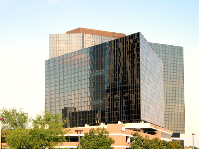
| Use of a polarizing filter may have helped the sky on this one. |
|
|
|
07/31/2002 08:35:00 AM |
| I think getting rid of the sky/trees would give a nice abstract shot. It's got good angles. |
|
|
|
07/30/2002 10:39:00 PM |
| Yep, definitely a headquarters. The sad thing is that even though I don't think I've seen this particular building, I've seen so many others like it that they all start to look the same. I'm sure the architect told the company they'd really stand out... Yeah, right. |
|
|
|
07/29/2002 11:53:00 PM |
| I would like to see a tighter shot on this subject. There seems to be too much sky which is very washed out and distracting. Also, I think a tighter shot would help make this building seem more dominating and imposing, thereby helping get the point across better. |
|
|
|
07/29/2002 10:39:00 PM |
| Very nice architectural shot. One of my favorite entries this week. |
|
|
|
07/29/2002 10:28:00 PM |
| looks too bright to me and might have more impact if it was more tightly cropped, especially on the left. |
|
|
|
07/29/2002 05:38:00 PM |
|
|
|
07/29/2002 03:26:00 PM |
| Meets challenge entirely but not very original. Sky is very flat. |
|
|
|
07/29/2002 01:25:00 PM |
| I'd crop the top and left sides some - too much white space. |
|
|
|
07/29/2002 02:43:00 AM |
| Good composition. Simple subject matter. Simple message. |
|
Home -
Challenges -
Community -
League -
Photos -
Cameras -
Lenses -
Learn -
Help -
Terms of Use -
Privacy -
Top ^
DPChallenge, and website content and design, Copyright © 2001-2025 Challenging Technologies, LLC.
All digital photo copyrights belong to the photographers and may not be used without permission.
Current Server Time: 04/27/2025 08:51:14 AM EDT.