| Author | Thread |
|
|
08/31/2006 05:32:35 PM |
| This is amazingly beautiful. Only reason it's not going in my favorites is because I recently reached 1000! |
|
 Photographer found comment helpful. Photographer found comment helpful. |
Comments Made During the Challenge  |
|
|
08/04/2002 10:45:00 PM |
Composition - good
Technical Aspects - good
Meets Challenge - yes
Visual Impact / Originality - good
|
|
|
|
08/03/2002 03:14:00 PM |
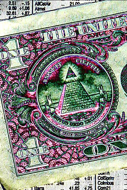
| looks an awful lot like a "Find Edges" filter |
|
|
|
08/03/2002 04:32:00 AM |
| 1 dollar a share sounds great. Good contrast, would have used a cleaner bill. |
|
|
|
08/02/2002 10:48:00 PM |
| I really would like to know how you did this (the colors). that is a neat effect. karmat |
|
|
|
08/02/2002 10:09:00 PM |
|
|
|
08/02/2002 05:52:00 PM |
| I think this is a neat image without the color adjustments. the color adjustments do make it look 'unique' but I don't see how it adds to the image.. - jmsetzler |
|
|
|
08/02/2002 01:22:00 PM |
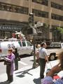
| This is a great representation of the stock market. I love the dirty, grainy feel to this photo. |
|
|
|
07/31/2002 09:19:00 AM |
| Love it, hate it � I'm not sure� In some ways it's artistic, but the colours seem very sickly. I can't say that I can really score too highly � sorry, others may prove me in the minority� |
|
|
|
07/31/2002 06:37:00 AM |
|
|
|
07/30/2002 09:58:00 PM |
| It's a little eerie how a color shift like that can really bring out the Illuminati in everything... Like the dollar on the stock market page, but I'd like to see more of the stock page, especially something like a downward graph or a foreign currency quote. |
|
|
|
07/30/2002 08:43:00 PM |
| I feel the effects add nothing to this photo. |
|
|
|
07/30/2002 06:36:00 PM |
| Too much fun with photoshop? |
|
|
|
07/30/2002 06:02:00 PM |
|
|
|
07/30/2002 10:09:00 AM |
| Bold use of curves and colour tweaks here but I'm left thinking it wasnt necessary - what does it add to the photo besides interest? The interest should really come from the subject matter. |
|
|
|
07/30/2002 05:43:00 AM |
|
|
|
07/29/2002 07:51:00 PM |
| I had to stare at this one awhile just to figure out if I liked it or not, yet another dollar bill. But then it got to me. The coloring grabbed me first, and then as the message sunk into my gray matter I really took a liking to it. Creative storytelling. |
|
|
|
07/29/2002 01:48:00 PM |
| In a PS challenge, this rates well. However... |
|
|
|
07/29/2002 12:55:00 PM |
| looks like it was manipulated a bit too much; good lines though |
|
|
|
07/29/2002 12:34:00 PM |
|
|
|
07/29/2002 09:43:00 AM |
| good use of effects, symbolism |
|
|
|
07/29/2002 03:16:00 AM |
| OMG! I hadn't noticed! :) |
|
Home -
Challenges -
Community -
League -
Photos -
Cameras -
Lenses -
Learn -
Help -
Terms of Use -
Privacy -
Top ^
DPChallenge, and website content and design, Copyright © 2001-2025 Challenging Technologies, LLC.
All digital photo copyrights belong to the photographers and may not be used without permission.
Current Server Time: 03/13/2025 01:49:05 AM EDT.