| Author | Thread |
Comments Made During the Challenge  |
|
|
08/04/2002 05:16:00 PM |
| Like the colour tinge, is it intended? |
|
|
|
08/04/2002 08:41:00 AM |
| the colour scheme looks werid in this photo, was it purposeful? there's like too much purple in the picture. |
|
|
|
08/03/2002 05:00:00 AM |
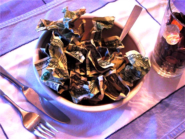
| I especialy lke the angle you took this picture from. Just a guess you're left handed. If the knife were in the green salad it would say a whole other story however a spoon gives a since of greed. The best part this guy even needed the small change to wash it down (crook). Every asspect of this photo is well thought out. Love the colours. 10 |
|
|
|
08/01/2002 03:18:00 PM |
| The knife and fork are upside down..lol. A little shadowing too, perhaps, but funny. :-) |
|
|
|
07/31/2002 05:12:00 PM |
| Your picture has impact! "BAM" as Emeril might say. The coloring is sort of surreal, and is very fitting. Something so basic as eating, is so familiar to all. So right off you identify with your audience. VERY GOOD! Then as my eye wanders over the scene I am impacted with UGH! Eating money....yuck! So the photo effectively provoked disdain. VERY GOOD! Brilliant photo. A little bitty thang that is distracting is the crease in the fabric but at least it's on a nice diagonal... :-) Oh and technically...yeah...looks fine to me. 10 Gracious |
|
|
|
07/31/2002 04:47:00 PM |
| Why are the knife and fork upside down? IMHO the colours look a bit odd, too much blue cast and generally a bit fuzzy. |
|
|
|
07/31/2002 01:37:00 PM |
| This is a really good idea! I especially like the coin drink! First, it does appear on the dark side on my monitor. Next, I question your photo angle and cropping. I would suggest taking this from the view of the eater. Next, I would suggest not cropping the basic elements out of the shot. (I'm so square, I like seeing the whole picture) Lastly, the red glow? Is that from a filter? Kinda surreal, if that was what you were going for....Good job! 8 Swash |
|
|
|
07/31/2002 11:43:00 AM |
| Color seems odd, like the green channel is low. Good subject |
|
|
|
07/31/2002 09:24:00 AM |
| Witty idea, original and to the point� Although, I'm not sure I like the lighting effects or understand their meaning. The lighting (in my opinion) has generated overkill on a image that could easily stand on its own without it. |
|
|
|
07/31/2002 06:42:00 AM |
| can I have seconds please? |
|
|
|
07/31/2002 01:00:00 AM |
| IMHO, it would have been a stronger picture with natural colors. Good composition and exposure though. |
|
|
|
07/30/2002 08:42:00 PM |
| Clever play on words with a picture... Colorful! |
|
|
|
07/30/2002 04:26:00 PM |
| Great idea. The only thing that distracts me is the use of purple. I"m not sure how that fits in. I'd also either get rid of the glass or fill it with something that relates to the metaphor. Composition and light is good though. |
|
|
|
07/30/2002 04:17:00 PM |
| was the blue/purplish tint intentional? kinda a neat effect. Good idea, but I think the bowl should be further down in the picture. Maybe crop the utensils and not the glass. karmat |
|
|
|
07/30/2002 09:23:00 AM |
Composition8
Technical Aspects8
Appeal6Interesting concept, but I don't care for the ovetones of pink and blue.
Difficulty6
Rating7
Autool |
|
|
|
07/30/2002 01:36:00 AM |
| 7 for the intriguing angle |
|
|
|
07/29/2002 08:15:00 PM |
| reminds of where i went to school |
|
|
|
07/29/2002 02:40:00 PM |
| this is a great idea although there ar a few things i would change. The color seems off- a little purplish-. I might change the lighting a littlwe so the shadow isnt so oviouse. |
|
|
|
07/29/2002 02:32:00 PM |
| It's what my schoolmates have for lunch. |
|
|
|
07/29/2002 02:03:00 PM |
|
|
|
07/29/2002 12:33:00 PM |
|
|
|
07/29/2002 10:41:00 AM |
| good idea and effective use of lighting...maybe a solid colored table cloth with stripes would be more dramatic? |
|
|
|
07/29/2002 09:47:00 AM |
|
|
|
07/29/2002 09:32:00 AM |
| like it. color a bit off 6 |
|
|
|
07/29/2002 08:30:00 AM |
| Great colours, contrast and concept. Perhaps a little too much contrast. |
|
|
|
07/29/2002 03:56:00 AM |
| The odd light color is somewhat distracting; so is the shadows in the dollar bills. This might look better with some even handed lighting, perhaps something to bring out some of the deep shadows inside the crumpled bills? |
|
|
|
07/29/2002 01:37:00 AM |
| My first reaction was that the fork and knife should be facing the viewer... This lets the viewer off the hook by suggesting it is someone elses greed. I like the play of light through the glass |
|
|
|
07/29/2002 12:15:00 AM |
| Of all of the "money down the drain" pictures, this is by far the best. |
|
Home -
Challenges -
Community -
League -
Photos -
Cameras -
Lenses -
Learn -
Help -
Terms of Use -
Privacy -
Top ^
DPChallenge, and website content and design, Copyright © 2001-2025 Challenging Technologies, LLC.
All digital photo copyrights belong to the photographers and may not be used without permission.
Current Server Time: 03/13/2025 12:37:12 AM EDT.