| Author | Thread |
Comments Made During the Challenge  |
|
|
08/03/2002 04:42:00 AM |
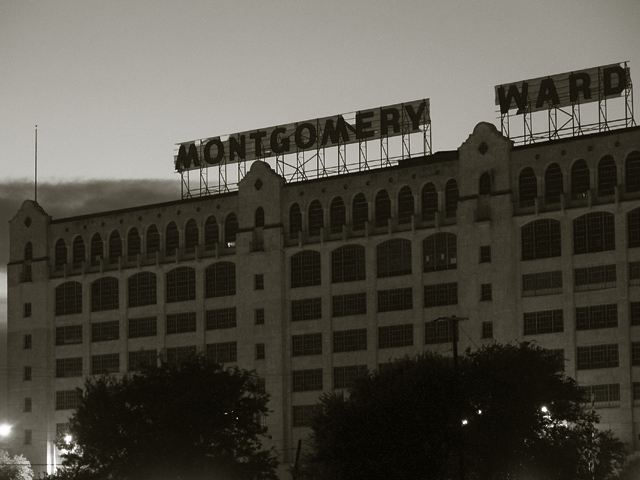
| and then? well done. if "ward" was a little clearer 8 but 7 |
|
|
|
08/02/2002 04:27:00 PM |
| So sad. This was one of my favorite stores, too. I like the darkness of this picture, it really sets a sombre mood. My only suggestion would be to frame it so that the sign was further to the right. I feel like i am moving quickly out of the frame with it so close to the right edge. karmat |
|
|
|
08/02/2002 09:49:00 AM |
| excellent use of darkness to convey a mood here... good job on providing enough detail to see the building... good shot :) - jmsetzler |
|
|
|
07/31/2002 03:41:00 PM |
| Was this taken at night, it seems very dark and those lights at the bottom make me wonder. I have no idea who Montgomery Ward are, do I need to know before I can judge this or is it just a generally run down looking building. Sorry, not sure about this at all. |
|
|
|
07/31/2002 07:58:00 AM |
|
|
|
07/31/2002 05:06:00 AM |
| This picture is a little too dull for my liking. The image itself is quite powerful; perhaps a hint of colour would have added atmosphere � even sepia perhaps? The darkness of the image was � I think � intentional in order to add drama, but it only seems to remove detail rather than add ambience. Sorry, I hate being negative, but I think the message was great, but it got lost somewhere� |
|
|
|
07/31/2002 03:57:00 AM |
|
|
|
07/30/2002 05:41:00 PM |
| I like the atmosphere. Very LA Confidential-ish, even. |
|
|
|
07/30/2002 09:54:00 AM |
|
|
|
07/30/2002 08:51:00 AM |
| The sky is a little too light - makes the subject of the photo too dark. And the bright light in the bottom left is very distracting. |
|
|
|
07/30/2002 01:39:00 AM |
| Ft. Worth? nice shot, but I wish it were a tad brighter... |
|
|
|
07/29/2002 09:23:00 PM |
| This could have been a terrific shot at perhaps a different time of day for better lighting. And perhaps a different angle to cut out the distracting trees and lights, just capturing the age and collapse of an empire... You had the idea, just not the time put into it... |
|
|
|
07/29/2002 01:22:00 PM |
| Almost forgot about them. Dark and dreary, but little shy on contrast to make this a really stand-out photo. |
|
|
|
07/29/2002 10:54:00 AM |
| I like the lighting in this photo...very ominious feeling to it. Possible improvements might include centering on the monkey wards sign, brightening a little to help out the contrast, and getting a perspective without the trees. Very strong on topic...good job! 7 Lisa |
|
|
|
07/29/2002 10:51:00 AM |
| By cropping out the lights the story takes on a gloomier mood. Good idea though. |
|
|
|
07/29/2002 09:45:00 AM |
| God it's been a long time seens I've see montgomery wards store bring's me back a hundred years. |
|
|
|
07/29/2002 05:21:00 AM |
| This is exactly what I had in mind when I thought of the challenge. I like repeating patterns, and the overall "moody" feel. I think I would have liked it better with the lights at the bottom cropped out - the lights give it a "lived in" feel, and I would have liked a little bit more of a "dark, desolate" feel. lhall |
|
|
|
07/29/2002 03:17:00 AM |
| Difficult lightig situation... maybe spot metering the signage may have produced a better exposure |
|
Home -
Challenges -
Community -
League -
Photos -
Cameras -
Lenses -
Learn -
Help -
Terms of Use -
Privacy -
Top ^
DPChallenge, and website content and design, Copyright © 2001-2025 Challenging Technologies, LLC.
All digital photo copyrights belong to the photographers and may not be used without permission.
Current Server Time: 03/12/2025 06:48:12 PM EDT.