| Author | Thread |
Comments Made During the Challenge  |
|
|
09/13/2006 10:40:50 AM |
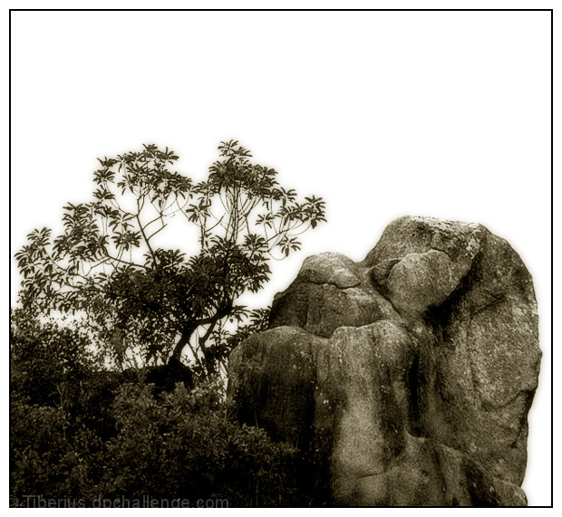
| I see 3 dominant features: tree, rock and white space. To me, the white dominates and its not appealing to look at. The composition of the rock and tree don't seem to work togehter. |
|
 Photographer found comment helpful. Photographer found comment helpful. |
|
|
09/13/2006 07:45:44 AM |
| great tones, contrast and mood |
|
| Photographer found comment helpful. |
|
|
09/12/2006 12:00:40 PM |
| I like the tone you chose and the forms. The rock enhances the overall image. |
|
| Photographer found comment helpful. |
|
|
09/12/2006 10:17:47 AM |
| Alot of great texture in this photo. nice tones albiet a little too soft in my humble opinion. |
|
| Photographer found comment helpful. |
|
|
09/12/2006 02:33:06 AM |
| it feels like there is no strong subject in this. it's cool and i like the pp choices you made but either the rock or the tree could be the subject, which weakens the effect |
|
| Photographer found comment helpful. |
|
|
09/11/2006 03:14:34 PM |
| Hmmm. This has potential. I think that washed out sky may have worked better if you had gone B/W with this. JMO of course. ;^) |
|
| Photographer found comment helpful. |
Home -
Challenges -
Community -
League -
Photos -
Cameras -
Lenses -
Learn -
Help -
Terms of Use -
Privacy -
Top ^
DPChallenge, and website content and design, Copyright © 2001-2025 Challenging Technologies, LLC.
All digital photo copyrights belong to the photographers and may not be used without permission.
Current Server Time: 04/27/2025 03:36:53 AM EDT.