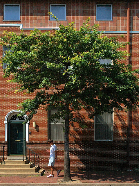
Convert from raw in PSElement 3.0 with +0.33 exposure compensation. Power Retouche Dynamic Range Compressor (default settings). Layer adjustments for levels, brightness/contrast and hue/saturation. Distortion correction to straighten the building and curb/sidewalk. Crop. Sharpen. Resize. Sharpen. Save for Web.
lucky to get a 5
Statistics
Place: 145 out of 251 Avg (all users): 5.2886 Avg (commenters): 6.6667 Avg (participants): 5.3030 Avg (non-participants): 5.2745 Views since voting: 837 Views during voting: 278 Votes: 201 Comments: 7 Favorites: 0
Hello from the Critique Club. My name is Christian, and I�m a member of the CC. Your picture has been assigned to me to critique. I hope you find this crit helpful; if you have any questions, please PM me.
The first impression is rather bland. At first, the image appears to be more of a snapshot. However, with further inspection, the viewer begins to see more interesting aspects of the image.
The composition is good, sound, yet quiet. The slightly off centre tree trunk works, as do the repetition of vertical and horizontal lines. The fact that there is no lens distortion on the image makes this a very interesting image. The elements are balanced in their imbalance � the window and downspout balance the door and the man. The moulding line echoes the downspout. This is a very sophisticated composition.
The exposure is good, although the light is a bit harsh. The tones are very well shown, and there is good detail in both highlights and shadows; a good tonal range.
I particularly like the square blue windows in the band of square terracotta tiles.
So, what could improve this image? I think the person is just too static, and the image does not draw the viewer in. Sadly, without that initial hook, the viewer does not stay long enough to appreciate the image properly.
What would I do differently? The framing is perfect, and I understand that this is probably a candid. But, if this was shot at a time of day with lower light, and the figure was moving faster (a jogger, running child, roller-blader, cyclist�) the motion blur would provide that spark of interest to hold the viewer, so they can appreciate the whole image.
I hope this has been helpful. If you have any questions about this, please pm me.
Nice location. I think, however, that the composition is lacking. Everything happens in the lower left corner of this image...but without meaning. I'd like to see the rest of the stoop, for example. I don't understand what the casual stroller (checking his cell messages?) is adding to the image. The tree...well what can one say about dead center? There are lovely, interesting shadows of the tree on the wall and walk to the right...I just wonder what you could have done with them had you re-composed the shot.