| Author | Thread |
|
|
10/09/2006 07:31:15 AM |
Hello from the Critique Club,
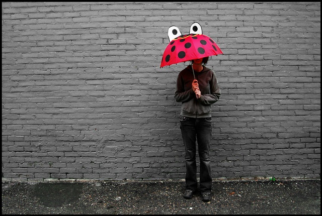
I remember when voting on this image that my first impression was "Very simple idea that was well done". I like the colors and lighting and the eyes on the umbrella are fun to look at. However, this image has a lot of negative space that doesn't really have any purpose. This could have been stronger compositionally if it had been cropped in portrait instead of landscape. Another option would have been to have the person turn slightly to her right so that the umbrella eyes were looking towards the left side of the image. This would have given the negative space on the left purpose (space for the eyes to look off into) and turned the dark area on the ground into a secondary focal point instead of a distraction (the eyes could have been looking towards that spot).
Tim
|
|
 Photographer found comment helpful. Photographer found comment helpful. |
|
|
10/05/2006 10:44:52 AM |
I really like this shot!
My CONSTRUCTIVE Recommendations: I'd either show the person's face or not show it at all. The partial face is distracting. I like the composition of the shot, but a close-up may have done a better job of showing the rain and helped the shot in the contest.
RIBBIT! |
|
| Photographer found comment helpful. |
|
|
10/04/2006 12:23:52 PM |
| awesome!!! so creative! i love it! |
|
| Photographer found comment helpful. |
Comments Made During the Challenge  |
|
|
10/03/2006 01:12:05 PM |
| Cute! I like the all gray with the pop of color, it brings your eyes right to the eyes. :) |
|
| Photographer found comment helpful. |
|
|
10/01/2006 03:40:38 AM |
| Too contrived.......Love the brolly - Could have been better matbe walking through a crowd.........And showing some rain... |
|
| Photographer found comment helpful. |
|
|
09/30/2006 10:55:39 PM |
| Love the wall and the color play of this image. Funny too! |
|
| Photographer found comment helpful. |
|
|
09/30/2006 07:16:39 PM |
| Cool, cute take on the challenge |
|
| Photographer found comment helpful. |
|
|
09/30/2006 10:52:13 AM |
| I like the composition and the simplicity of the red and grey color scheme. It is hard to tell if selective desaturation was done in post-processing or done through very careful selection of background and clothing. Either way, it works for me. Ordinarily, I hate selective desaturation, but because this doesn't have the look of that process, it's very successful. |
|
| Photographer found comment helpful. |
|
|
09/30/2006 02:00:42 AM |
|
| Photographer found comment helpful. |
|
|
09/28/2006 01:13:15 PM |
| i like teh composition, but don't know if so much emphasis needs to be on the grey wall. i almost think a tight crop from a few inches above the umbrella to a few inches below the hands with a bit of the wall filling in some negative space in the background would be a 9 or 10 image. love the idea here. |
|
| Photographer found comment helpful. |
|
|
09/28/2006 07:06:13 AM |
| Cool umbrealla! Level the horizon up and place the model more to the right of the frame |
|
| Photographer found comment helpful. |
|
|
09/28/2006 01:18:15 AM |
| Nice one. There is no rain still its a nice capture. Loved how a single color is highlighted in mostly colorless background.8. |
|
| Photographer found comment helpful. |
|
|
09/27/2006 09:11:58 PM |
| ...that is the BEST umbrella I have seen in a looooong time...great shot. |
|
| Photographer found comment helpful. |
|
|
09/27/2006 07:01:10 PM |
| I had to laugh! I think you've got some issues if you don't laugh when you see this! I hope this one gets top three at least because it will brighten anyone's day!!! Amazaing and going into my favorites! 10 10 10! 8o) |
|
| Photographer found comment helpful. |
Home -
Challenges -
Community -
League -
Photos -
Cameras -
Lenses -
Learn -
Help -
Terms of Use -
Privacy -
Top ^
DPChallenge, and website content and design, Copyright © 2001-2025 Challenging Technologies, LLC.
All digital photo copyrights belong to the photographers and may not be used without permission.
Current Server Time: 03/12/2025 04:53:02 PM EDT.