| Author | Thread |
|
|
10/04/2006 08:36:15 PM |
CRITIQUE CLUB COMMENT:
Keep your chin up...the following critique is a little rough to read. Don't take it too personally....take what you find usefull and forget th rest! :)
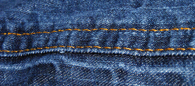
IMAGE QUALITY
The image quality is good but unfortunately the image fails to score high for two primary reasons. First, the image is not "abstract" enough. In abstract the idea is to have the subject not be immediately recognizable. This shot is very easy to figure out. Secondly, the macro part fails because it's just not macro enough. When I think macro I'm thinking REAL close like at least 1:1 ratio or greater (more like 4:1 or 5:1) Looks like you shot this with the 18-70 lens and that lens just doesn't give you a nice enough macro for this challange in my opinion. That's not your fault. I just might not have entered this challenge with that lens to work with.
CHOICE OF SUBJECT
The choice of subject hurt you because again, it's too readily identifiable. You'd have been better off shooting something people don't see every day, especially if your lens limits your macro ability. By shooting something people don't see every day or don't see in that perspective you could get away with not having a good macro lens.
COMPOSITION
The composition doesn't do anything for me either unfortunately - too many straight horizontal lines. Perhaps if you would have focused on a rivet and off centered it a little or focused on some stitching that zigged and zagged around a little it would have drastically helped the composition.
CREATIVITY
I'd deduct a point on creativity for titling the photo "Blue Jeans" because again, the idea is to be abstract (not identifiable) so you really don't want to identify the subject in your title.
POST PROCESSING
The post processing is fine. You might have gotten a better look if you increased the contrast a bit more and maybe even darkened the photo a bit.
By the way, nice camera! I've got the Minolta 5D and then Minolta sold out to Sony and I was very upset. When the first Sony DSLR came out for the Minolta mount I read up on it and it seems like a sweet camera. Hope you enjoy it! |
|
 Photographer found comment helpful. Photographer found comment helpful. |
|
|
10/02/2006 07:19:05 AM |
| You are getting better. Higher score than the last one. Great show of fabric grain on this one, and the color is right on. |
|
| Photographer found comment helpful. |
Comments Made During the Challenge  |
|
|
10/01/2006 12:26:56 AM |
| Technically it's fine, but not really abstract. |
|
| Photographer found comment helpful. |
|
|
09/26/2006 04:21:19 AM |
| the ripples in the fabric between the stitching looks a bit like a ladder so i like it better when i tilt my head to one side. thank goodness it wouldn't look better upside down because there's no way i can stand on my head in this office! |
|
| Photographer found comment helpful. |
|
|
09/25/2006 06:39:55 PM |
| Hmmm....this looks kind of like a desperation shot. I could be very wrong but it doesn't appear that much consideration went into this...there isn't anything drawing me in, making me want to linger with the image. |
|
| Photographer found comment helpful. |
Home -
Challenges -
Community -
League -
Photos -
Cameras -
Lenses -
Learn -
Help -
Terms of Use -
Privacy -
Top ^
DPChallenge, and website content and design, Copyright © 2001-2025 Challenging Technologies, LLC.
All digital photo copyrights belong to the photographers and may not be used without permission.
Current Server Time: 03/12/2025 10:50:03 AM EDT.