| Author | Thread |
|
|
08/12/2002 10:48:00 PM |
| should have placed much higher |
|
Comments Made During the Challenge  |
|
|
08/11/2002 02:37:00 PM |
| Good colour work. This works for me. |
|
|
|
08/10/2002 04:06:00 PM |
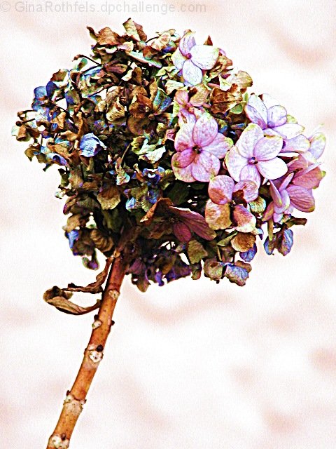
| Bizarre colours. Did you do some histogram tweaking or was it really that vivid? I can't make up my mind whether I love it or if it's just too dead and decaying to like at all! Great photo. |
|
|
|
08/09/2002 11:52:00 PM |
| I like the colors and the framing/composition on this. Something just seems off to me. I'm seeing it as kinda flat, but I'm not sure what it needs to really make it *pop* Sorry. karmat |
|
|
|
08/09/2002 07:51:00 PM |
| unusual subject well done |
|
|
|
08/08/2002 04:34:00 PM |
| The colors don't seem natural, so I am assuming the colors were tweeked. That said, this is interesting, but maybe a little overly tweeked for my tastes. The background interests me, if for nothing else, wondering how it was achieved. Challenge well met, decent focal range, nice framing.... Didn't like this shot very well at first, but it grows on you, plus I cannot really gripe about the photography skills, so I going to raise your score from 6 (bad first impression) to 8, favorable review upgrade! Swash |
|
|
|
08/08/2002 01:40:00 PM |
| Quite fascinating what you have done to the hydrangea-the colours are very interesting-quite gemlike -andrewm |
|
|
|
08/08/2002 10:03:00 AM |
| i really like this photo. The tonal background is a perfect compliment to the aging hydrangea. Very well done. |
|
|
|
08/07/2002 10:19:00 AM |
| I think this looks quite good visually/artistically, however I expect that it will suffer greatly in scoring because it looks like an art piece rather than a photograph. Some people are (very) touchy about blurring the line between the two, much more than I am. That asside I would add that it does seem a little over-sharpened, but that I think the colors work. --7 Agamemnon |
|
|
|
08/07/2002 05:06:00 AM |
| Interesting choice of processing effects - Im not sure it doesn't detract a litetl from the shot. I like the way the flowers are alive on one side and dead on the other. But that is hidden by the processing. |
|
|
|
08/06/2002 08:32:00 PM |
|
|
|
08/05/2002 08:03:00 PM |
| Very pretty. This would look nice printed on a card with a vellum overlay with the writing. An invitation of some sort. seems a little too...sharpened maybe? not sure |
|
|
|
08/05/2002 06:41:00 PM |
| This is a well composed photo... the color adjustments just don't grab me... the colors seem to contradict with each other... - jmsetzler |
|
|
|
08/05/2002 12:54:00 PM |
| Wow, that's pretty cool looking! Took my eyes a minute to adjust, but I really like the colors. Nice work! |
|
|
|
08/05/2002 01:30:00 AM |
| nice contrast between the fresh and dying flowers. |
|
Home -
Challenges -
Community -
League -
Photos -
Cameras -
Lenses -
Learn -
Help -
Terms of Use -
Privacy -
Top ^
DPChallenge, and website content and design, Copyright © 2001-2025 Challenging Technologies, LLC.
All digital photo copyrights belong to the photographers and may not be used without permission.
Current Server Time: 12/14/2025 07:22:00 PM EST.