| Author | Thread |
Comments Made During the Challenge  |
|
|
08/11/2002 05:05:00 PM |
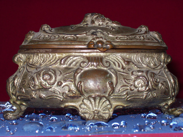
| pink strip in the front is distracting |
|
|
|
08/11/2002 04:29:00 PM |
| Nice subject, good texture. The red on the bottom detracts, as I'm sure many have already told you. The water on the blue is different but doesn't seem to fit, or add to the composition. |
|
|
|
08/09/2002 03:13:00 PM |
| Are those "RainX" bubbles?? Very nice. |
|
|
|
08/09/2002 07:36:00 AM |
| IMHO, the front flash is too bright. Although the object may be old, the photo doesn't reinforce/illustrate it. |
|
|
|
08/08/2002 12:53:00 PM |
| interesting effect with the water :) I would have tried to crop out the red line along the bottom of this photo... I think that a little bit of light diffusion between your flash and the subject could be an improvement also. when the flash is going to 'heat' up your image, you can do a few things to dampen it... one that works for me is to tape a piece of kleenex across the flash.. this dampens the flash and gives you the light you need for a subject shot like this one :) - jmsetzler |
|
|
|
08/08/2002 12:01:00 PM |
| I think cropping it a touch tighter at the bottom to eliminate the red/pink stripe would have improved this picture. It's got great focus, and I like the water drops. I also like the contrast between the background colors. karmat |
|
|
|
08/08/2002 06:36:00 AM |
| Is this wonderful old box sitting on a very wet tabletop? I hope it wasnt damaged! Otherwise - great to be able to see so much detail. I think my only criticism is the small amount of red at the bottom which needn't have been there and which makes the picture look like it slopes to the left. |
|
|
|
08/07/2002 10:36:00 AM |
Not quite sure what the blue material is, but it's kinda neat.
The diagonal red thingy at the bottom is distracting. The flash lighting is quite harsh, too-- but that thing sure does look old!
--5-- sohr |
|
|
|
08/06/2002 11:59:00 PM |
| Nice pic. I would have cut with the cropping the lower right edge to disapear the redish portion. I like the detail of the water drops and the combination of the blue surface against the background. |
|
|
|
08/06/2002 02:27:00 PM |
the water droplets are distracting and don't make sense
|
|
|
|
08/06/2002 12:36:00 PM |
| I find the water distracting and irrelevant |
|
|
|
08/05/2002 09:09:00 PM |
|
|
|
08/05/2002 02:10:00 PM |
| I like the close up, but the cropping distracts. (I hate when that happens to me too!) |
|
|
|
08/05/2002 11:41:00 AM |
| A very nice idea and I love the water droplets on the blue. I think a little different cropping could have helped, though. No need for the red line on the bottom to show. And it looks like you've cropped off the right foot, but not the left foot making it look a bit unbalanced. |
|
|
|
08/05/2002 10:10:00 AM |
|
|
|
08/05/2002 09:14:00 AM |
| I'm not too sure if it's just the texture of the object, but it seems a little bit out of focus...still though, very nice presentation. I like the water droplets :) |
|
Home -
Challenges -
Community -
League -
Photos -
Cameras -
Lenses -
Learn -
Help -
Terms of Use -
Privacy -
Top ^
DPChallenge, and website content and design, Copyright © 2001-2025 Challenging Technologies, LLC.
All digital photo copyrights belong to the photographers and may not be used without permission.
Current Server Time: 03/11/2025 12:56:16 PM EDT.