| Author | Thread |
Comments Made During the Challenge  |
|
|
08/10/2002 01:28:00 PM |
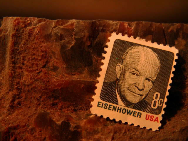
| I like this though it's a little too red and the strip at the top adds nothing. |
|
|
|
08/09/2002 12:09:00 PM |
| Excellent subject and great macro composition. Focus is a tiny bit soft, but that could be JPEG reduction. Toning is a little atrifical, but it seems to work. Good job. |
|
|
|
08/09/2002 02:12:00 AM |
| What is the stamp sitting on? Like the idea (and I even remember the stamp) but I con't "get" the background. 4 sjgleah |
|
|
|
08/08/2002 03:36:00 PM |
| Excellent set-up on this shot. Strange light colour. Very effective over all. |
|
|
|
08/08/2002 10:15:00 AM |
| Great and simple or simply great. The brown background is perfect to reinforce the age of the stamp - the gentle lighting very well done. 10 |
|
|
|
08/08/2002 03:35:00 AM |
now that's old!
pretty soon, you'll finally be able to use it as a rate-increase adjustment stamp lol
the framing is creative and adds interest. |
|
|
|
08/07/2002 09:18:00 PM |
| i guess stamps were cheaper back then ... nice idea. i'm not sure what the background is exactly and therefore not sure why you picked it. is the stamp really that yellow or is that the lighting? nice placement of the stamp in the photo. -- gr8photos (6) |
|
|
|
08/07/2002 06:34:00 PM |
| I like the stamp... the background looks a little awkward though... - jmsetzler |
|
|
|
08/07/2002 03:02:00 PM |
Quite pleasing.....The colors, texture and clarity are complimentary however, I find the torn/raw edge across the top distracting. 9
Syamjonimi |
|
|
|
08/07/2002 01:16:00 PM |
|
|
|
08/07/2002 10:49:00 AM |
| Love this one � it's a great macro shot with very good use of colour tone. My only gripe here is; I think the really great texture behind the stamp should have extended all the way to the top of the picture. That said, it doesn't spoil the feel of the picture. (9) |
|
|
|
08/07/2002 12:42:00 AM |
| Boy were those the days! The significance of the rock is not clear to me? rock of ages? good macro. |
|
|
|
08/06/2002 07:38:00 PM |
| Interesting picture with good composition. I personaly don't care for the red cast but I am sure it was to cause the subject to look older. Autool |
|
|
|
08/06/2002 04:17:00 PM |
| nice arrangement, what is the background? |
|
|
|
08/06/2002 12:25:00 PM |
| A little dark in color, but great tone and composition. |
|
|
|
08/05/2002 10:29:00 PM |
VERY NICELY DONE!!! The darkness of the photo is very effective. Is that somekind of rock the stamp is on - it's very interesting. Great photo 9
Ruthann |
|
|
|
08/05/2002 08:19:00 PM |
| i like the stamp, but what is THAT..a rock? |
|
|
|
08/05/2002 02:05:00 PM |
| The background is a bit distracting. |
|
|
|
08/05/2002 10:05:00 AM |
|
Home -
Challenges -
Community -
League -
Photos -
Cameras -
Lenses -
Learn -
Help -
Terms of Use -
Privacy -
Top ^
DPChallenge, and website content and design, Copyright © 2001-2025 Challenging Technologies, LLC.
All digital photo copyrights belong to the photographers and may not be used without permission.
Current Server Time: 03/12/2025 06:25:16 PM EDT.