| Author | Thread |
|
|
02/14/2008 12:41:53 PM |
Thisis an edit I did with the help of alot of the comments on this page, along with some suggestions from eyewave. eyewave.
Thanks to eyewave for his help and to all of you for your comments.
 |
|
|
|
06/24/2007 10:42:52 PM |
| I am surprised this didn't do a little better score-wise. I love the sun and rays you captured. I agree with Dr. Achoo's comments for the most part. Overall, the vibrancy of the color and the warmth of the sun makes this very appealing to me. |
|
 Photographer found comment helpful. Photographer found comment helpful. |
|
|
10/10/2006 11:27:34 AM |
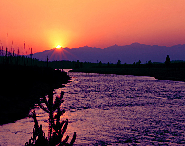
The technicals: You did well not to oversaturate the sky and get pixelation. The rays from the sun was a good idea. Having a foreground subject is good in landscape, but I'm not sure I would have chosen this one. Pines just are hard to photograph, period. The biggest downside, and one which immediately caught my eye, is the texture of the water. I don't think it's good. It's probably a product of being in no-man's land as far as shutter speed. Not fast enough to freeze the water, not slow enough to blur it. There are halos from PP which some people may have caught. (see the back trees
The feel: has a nice sunset feel. Things that would boost the score (but you have no control over) would be clouds in the sky to add interest and a more interesting foreground subject. |
|
| Photographer found comment helpful. |
|
|
10/09/2006 07:15:07 AM |
Even if it is not, the picture looks tilted. Too saturated for my taste. I find that tree in the foreground distracting. Have the feeling, there was nothing in focus and you sharpened too much in post-processing.
The background is very nice, but the contrast to the foreground is too high IMO - upper half=pastel and graet tonal range; lower half= vibrant color and little halftones.
I would really like to see the origina, maybe I can propose another way of post-processing
|
|
| Photographer found comment helpful. |
Comments Made During the Challenge  |
|
|
10/07/2006 12:44:25 AM |
| if you look at that front tree, you can see a ton of CA. I like the composition though, and the colors are neat. |
|
| Photographer found comment helpful. |
|
|
10/03/2006 05:19:03 AM |
| wonderful colors here, but it's also a bit too soft |
|
| Photographer found comment helpful. |
|
|
10/02/2006 04:37:45 PM |
| Great colours here filling the sky impressively. |
|
| Photographer found comment helpful. |
|
|
10/01/2006 12:55:48 PM |
an alternative title... Purple mountain majesty
Nice capture |
|
| Photographer found comment helpful. |
|
|
10/01/2006 08:16:21 AM |
| Another strong image here, but maybe a tad over saturated..... |
|
| Photographer found comment helpful. |
|
|
10/01/2006 12:22:33 AM |
Very interesting capture....feels a touch too contrasty...but still gorgeous.
(7) |
|
| Photographer found comment helpful. |
Home -
Challenges -
Community -
League -
Photos -
Cameras -
Lenses -
Learn -
Help -
Terms of Use -
Privacy -
Top ^
DPChallenge, and website content and design, Copyright © 2001-2025 Challenging Technologies, LLC.
All digital photo copyrights belong to the photographers and may not be used without permission.
Current Server Time: 03/13/2025 03:18:09 AM EDT.