| Author | Thread |
Comments Made During the Challenge  |
|
|
10/08/2006 10:09:22 PM |
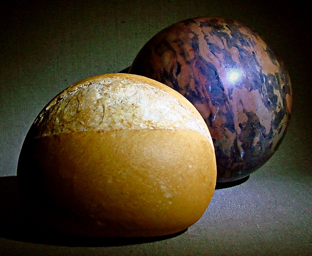
| Lighting is a bit harsh but the idea is good. In the thumbnail that doesn't look like bread. Cute. |
|
 Photographer found comment helpful. Photographer found comment helpful. |
|
|
10/07/2006 10:36:28 PM |
| nice concept, wish I could tell you how but a little work on your lighting might help. a bit to bright from the right, a little futher away from your background. Good luck, keep trying |
|
| Photographer found comment helpful. |
|
|
10/06/2006 10:24:09 AM |
Great idea - I like that...
However, I think the lighting could have been better and the background isn't the best either. |
|
| Photographer found comment helpful. |
|
|
10/06/2006 10:06:46 AM |
A great idea with a superb title.
Shooting from a different angle or cropping to eliminate most or all of the background would (for me)give more impact to the pic.
I like the fact that you`ve managed to match the shape of the two items..Very inventive. |
|
| Photographer found comment helpful. |
|
|
10/05/2006 08:05:50 PM |
| Perfectly on target with the theme. Great idea/title. Nice composition, balance and crop. Sharpness seems almost on the plus side but too close to call. My only suggestion would be to play around with a little "rockier" looking rock that was closer in color value to the roll. Might be be interesting to have more of the contrast in the subject and less in the color, but that's just an idea. Really good work. Score 9! |
|
| Photographer found comment helpful. |
|
|
10/05/2006 12:12:47 PM |
| The light splotch on the rocks detracts, as do the shadows. The concept is cool, however. |
|
| Photographer found comment helpful. |
|
|
10/03/2006 11:22:55 AM |
| If not for the flash really cool. |
|
| Photographer found comment helpful. |
|
|
10/03/2006 10:50:43 AM |
| Like it. Like the subtle tones and light. |
|
| Photographer found comment helpful. |
|
|
10/03/2006 05:25:05 AM |
| nice idea, but a real rock might have been better. lighting is too harsh, roll too dark at left side |
|
| Photographer found comment helpful. |
|
|
10/02/2006 02:27:09 PM |
Nice play on words. Focus and composition is excellent. The lighting is good except for the hot spot on the rock which is a tad distracting. Love the color and slight textured background. The hearthy color goes well with the rock and roll. Hope this one does well.
Forgot to mention how I liked how you took two unrelated objects and showed how they are related because of their similar shape and size. Well done. |
|
| Photographer found comment helpful. |
|
|
10/02/2006 01:07:33 PM |
| very good I like the conection, both begin with r and both are a rounded shape. well done |
|
| Photographer found comment helpful. |
|
|
10/02/2006 07:13:11 AM |
| Hehe... funny play on words. Try to use a softer light to avoid the heavy reflection on the "rock". |
|
| Photographer found comment helpful. |
|
|
10/02/2006 12:21:53 AM |
| LOL - Great concept!!! 10 from me. |
|
| Photographer found comment helpful. |
Home -
Challenges -
Community -
League -
Photos -
Cameras -
Lenses -
Learn -
Help -
Terms of Use -
Privacy -
Top ^
DPChallenge, and website content and design, Copyright © 2001-2025 Challenging Technologies, LLC.
All digital photo copyrights belong to the photographers and may not be used without permission.
Current Server Time: 03/12/2025 02:26:03 AM EDT.