| Author | Thread |
|
|
10/21/2006 08:58:52 PM |
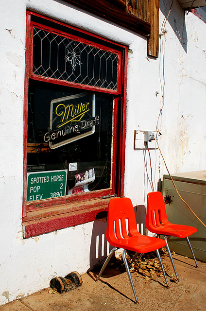
| I read about a town that had a population of one. |
|
 Photographer found comment helpful. Photographer found comment helpful. |
|
|
10/11/2006 06:06:46 PM |
| Heh - what a fun shot! I love that there are enough chairs for the entire population out front. Nice capture! |
|
| Photographer found comment helpful. |
|
|
10/11/2006 09:34:16 AM |
| Didn't post during challenge, but I just had to say this was one of my favorites and am sad to see it as low as it is. I thought not having an actual can/glass/drink in the picture was very refreshing! Also, the composition, colors, and concept really appealed to me. |
|
| Photographer found comment helpful. |
Comments Made During the Challenge  |
|
|
10/10/2006 06:24:13 PM |
| While maybe not great as an advertisement this picture is highly effective. I like the subtle humor you created by the title of the picture and the sign in the window. The vivid colors draw your eye around the shot forcing the viewer to explore the photograph. |
|
| Photographer found comment helpful. |
|
|
10/10/2006 04:03:02 PM |
|
| Photographer found comment helpful. |
|
|
10/10/2006 09:11:14 AM |
| This is clever.....I like it..... |
|
| Photographer found comment helpful. |
|
|
10/06/2006 06:22:32 PM |
| A tighter crop may have serve this better to display the miller logo more Prominently. If they could've turned it on it would've been much better. Nice comp and colors. |
|
| Photographer found comment helpful. |
|
|
10/06/2006 03:16:32 PM |
| both (of pop 2) gone Drinkin'? :) |
|
| Photographer found comment helpful. |
|
|
10/05/2006 12:39:52 AM |
| This shot is lacking one thing-- an old man in overalls lounging on the chair! |
|
| Photographer found comment helpful. |
|
|
10/04/2006 12:31:02 PM |
| Well, it is an advertisement! |
|
| Photographer found comment helpful. |
|
|
10/04/2006 11:16:12 AM |
| photo is nice but crop and straighten tyhe window sill would have been better |
|
| Photographer found comment helpful. |
|
|
10/04/2006 04:57:59 AM |
| It does not really seem to be an advertisement. |
|
| Photographer found comment helpful. |
|
|
10/04/2006 01:44:24 AM |
Miller Good Call :-) Nice shot. I love the color and composition. Saturation is excellent.
Idea is funny. |
|
| Photographer found comment helpful. |
|
|
10/04/2006 01:02:43 AM |
Nice study. I'd have aligned the left window side vertical.
Alternate title - "pop. 2" |
|
| Photographer found comment helpful. |
Home -
Challenges -
Community -
League -
Photos -
Cameras -
Lenses -
Learn -
Help -
Terms of Use -
Privacy -
Top ^
DPChallenge, and website content and design, Copyright © 2001-2025 Challenging Technologies, LLC.
All digital photo copyrights belong to the photographers and may not be used without permission.
Current Server Time: 03/12/2025 01:36:18 PM EDT.